The Decimation of the NHS
Geographers should be interested in what is happening to the NHS because it is through making geographical comparisons with other countries that we can see that its current decimation is unnecessary. The claim that there is no alternative but to spend less can be disproved by considering how other very nearby countries manage to spend more. Furthermore, there is a geography to the cuts that have taken place in the UK which reveals where is prioritized and where is not. Finally, very local geographical stories, such as a two briefly told here from Oxford and Glasgow, can also help reveal what is going on.
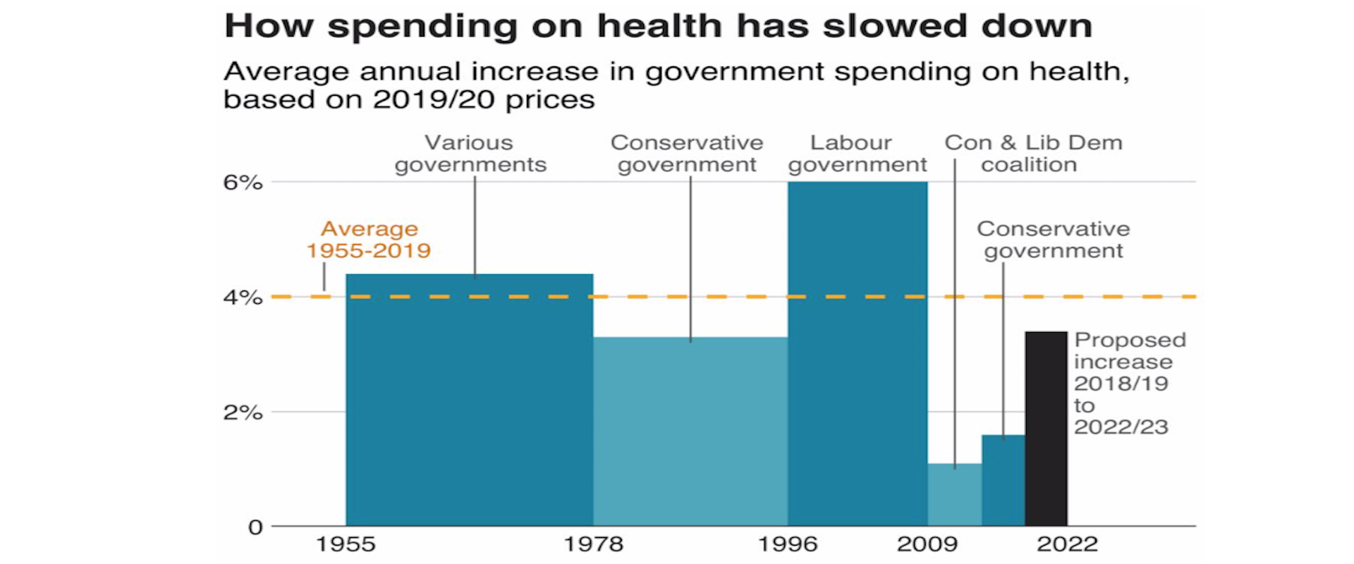
Over a year ago, on January 9th 2020, the BBC published a new story entitled ‘11 charts on the problems facing the NHS’. The second of those charts is produced here and shows how cuts in spending increases for the NHS began in earnest in the late 1970s, were briefly reversed for thirteen years after 1996; but then began again after 2009. All of these changes were political choices, as the labelling of the graph makes clear, although there had been something of a political consensus between 1955 and 1978 when spending increases were usually above 4% a year regardless of the political party in power in the UK.
How Spending on health has slowed down
Reproduced from BBC source
A spending increase of 4% a year does not mean an actual improvement in service, it often means just holding the line. This is especially so today when the population is ageing far faster than it was in the 1960s or 1970s. That BBC article went on to show that spending on health care in the UK is much lower as a proportion of GDP than it is in France and Germany, and that is even the case when private health spending is included. It also showed that there was little difference in outcomes in the different countries of the UK, almost certainly because spending across them varies so little as compared to spending across Europe. In 2017 health spending in the UK as a whole, including all the spending on private hospitals was almost identical to the EU average. Today it will almost certainly be less than that average, not least as other countries in Europe have responded with a larger increase in emergency spending due to the pandemic. This is alongside the now usually higher increases in health spending that most other European countries are making as they bolster up their health services more widely. In contrast, the UK government plans to reduce public spending overall once the pandemic has subsided, as illustrated by the submissions it has made to the International Monetary Funded on planned future public spending.
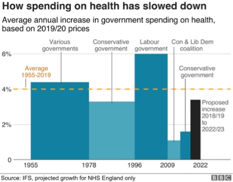
The final graph the BBC published in their series of eleven illustrates one theory as to why these choices have been made. That graph was entitled ‘Patient satisfaction with the NHS’ which was falling until 1997, then rose as public spending rose, to a high of 70% being ‘very or quite satisfied’ in 2009, before falling again afterwards. Satisfaction with the NHS tends to track how well the NHS is able to cope, which in turn is largely determined by how well it is funded and organised.
Patient satisfaction with the NHS
Reproduced from BBC source
Why would some politicians instigate changes in funding that inevitably result in a fall in satisfaction with the NHS? These politicians often say that a continuation of funding increases could not be maintained. That clearly was not the case as other countries in Europe chose differently despite suffering similar economic shocks at particular times. Geographical comparisons are a key way in which you can determine if the politicians are lying to you about what is possible, as compared to what they are choosing to do.
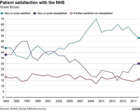
Of course, there is always some part of the UK that is receiving a greater increase in health funding, or less of a decrease, at any one time. Politicians tend to point to the increases to say that they are doing something substantial. It is well known that the UK government has promised “40 new hospitals” in England. What is less well known is that hardly any of these hospitals are new, most are extensions to (or rebuilding on) existing sites; but even here there is a clear geographical pattern to what is planned as yet another graph, this time published by the BBC on December 1st 2021 makes clear. The forty planned projects are concentrated in the South West of England; although as the BBC story that accompanied that graphic made clear, there are now doubts as to whether most of those will happen on time. More importantly, even if the planned projects were to all be completed they would not reverse the decimation that has been occurring more widely or even begin to address the increase in need that comes as we age and become more frail overall. Neither would they begin to cope with the health legacy of a pandemic and a disease which is becoming endemic, resulting in greater levels of illness than before for an as yet unknown number of years to come.
Breakdown of hospital projects by region
Note the numbers sum to 40. Reproduced from a BBC source.
What is going on? I grew up in the city of Oxford in England at a time when the NHS was well funded and in a city with a surfeit of public hospitals. I left the city when I was aged eighteen and returned nine years ago. One of many shocks on returning was discovering what had happened to the old ‘Manor’ ground where Oxford United used to play. It now housed a brand new private hospital, built walking distance from the old public hospitals so that consultants who chose to do part private work could walk over with ease. Before the private hospital had been built, there had been much less opportunity to expand the private health sector in the city. Later I discovered that some Oxford colleges offer to fund private health insurance for their academic and other staff. Something dystopic was happening, however slowly and gradually so that each of us can tell a story of the dismantling of public health care, but few of us can see the overall orchestration underlying this.
In January 2020 it was quietly announced that a new £20 million private hospital had been opened just off the Old Govan road in Glasgow. The ‘Ross Hall Clinic Braehead’ was described as “state-of-the-art” by the Daily Record. Nestled on an industrial estate between an accountancy firm, a computer shop and opposite a new charging station for electric cars, “The new hospital includes 17 new consulting rooms, a new MRI scanner alongside new respiratory, colposcopy and urodynamic departments. The inclusion of these key additions will mean that an extra 200 outpatients a day will be able to receive care from clinical specialists”. But of course only a few people will be able to afford to use these services, and others will rely on the NHS sending them there, if it is able to do so.
The pandemic could have begun a sea-change in the direction of health care and health care spending across the UK. Many private hospitals would not have survived it had they not been supported by state contracs and emergency funding to keep them solvent. We could have nationalised most of the new private facilities, at almost no cost – given that they were no longer solvent. Instead they were supported, kept alive for when they could beginning full-operating again; and new private facilities were built during the pandemic.
In relation to the growth in need, health care spending has been decimated across the UK. One reason this is allowed to happen is because small but growing proportion of the population can afford to by-pass the ever-lengthening waiting lists; they do not have to worry about what will happen to them if and when they fall ill. They receive an increasingly better level of service as compared to what most people can access. And the politicians who have presided over this growing social and health divide are not unaware of this. In fact they are often lobbied by private health care companies or have even more direct involvement than that.
Why should British geographers care about any of this? One reason, perhaps the most trivial, is that it will affect the maps of health outcomes for many years to come. To the extent that differential health and social care is part of the reason as to why people live shorter lives in some areas rather than others. A less trivial reason is that even if they are not worried about the direction their society is travelling in generally they could worry about themselves. A recent RGS/IBG survey found that 51% of students who go on to study Geography at University do so because they rank “earning a good salary” as important (while only 19% said they ranked “doing ‘good’ through my job” as important). However, only a minority, even of that 51%, will ever earn enough to be able to afford private health care.
For a PDF of this article and link to where it was originally published click here.