The ever ending never ending pandemic

How little we knew two years ago and how little we still know now. If you keep a diary, or more likely an electronic calendar, look back to January and February 2020. Compared to today was your diary more full back then? Did you have friends visiting from far flung places? Were you attending numerous meetings, travelling more then, even if only around the town or city you might live in? What did you do in the evenings and was it different? Was your calendar a jumble of commitments and (what we now call) ‘in-person meetings’. It was not quite pre-war; but it was certainly pre-pandemic. For my generation our lives will be divided into pre-pandemic and post-pandemic.
Now look back a year or so to January and February 2021, as the second wave peaked. I am a Geographer and so the story I will tell here is geographical. By late 2020, the ONS weekly surveillance survey of a random sample of the population had become large enough, and the disease was widespread enough, that estimates could be published of how many people in small areas of England were infected at any one time. These rates were both higher than the widely reported daily case rates and more reliable, as many of the people tested were positive but asymptomatic. Figure 1 shows the trends at this time. It uses a log scale because the variation between areas was so wide. Most of December 2020 is missing as, at that point, ONS were unsure that the data was reliable enough to publish.
Figure 1: People in 116 areas of England with COVID19: November 2020 to March 2021, %
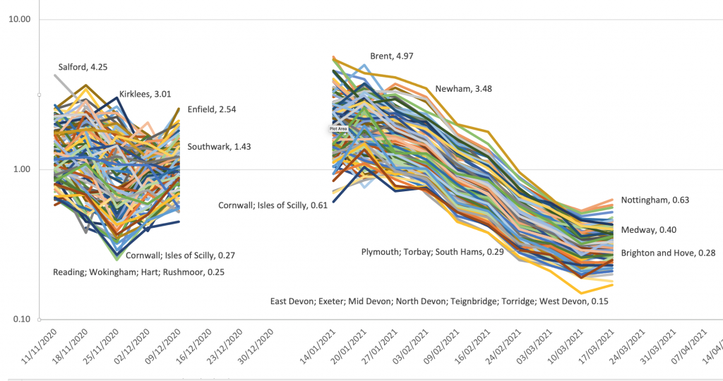
Figure 1: People in 116 areas of England with COVID19: November 2020 to March 2021, %
Source: ONS Coronavirus (COVID-19) Infection Survey, data normally in table 1m when data not missing.
In autumn 2020, as wave 2 rose up, at any one time around 1% of the population were infected, but this varied from 4.25% in Salford to only 0.25% in Reading (and its surrounds). These estimates were smoothed by ONS and so the full extent of the variation cannot be seen here. The smoothing may well have made the declines seen in most of January and February 2021 appear smoother than they really were. But during those dark and lonely winter lockdown months a year ago disease rates really were plummeting everywhere. I have labelled a few of the areas to give an idea of what kind of areas were most and least effected at different times.
In the late spring and early summer of 2021 the disease in the UK abated. ONS then stopped releasing surveillance data for small areas until the end of June. In July, as Figure 2 shows, as the disease rose up again at the start of a third wave, rates became highest in Northern cities and lowest in more remote southern English districts, but also in Hull which caught the third wave later on. This wave peaked just South of the River Tyne and on the River Wear when at one point 4.1% of the population were infected. The peak was almost ten times lower in parts of Suffolk that were least effected, but even there a peak was discernible.
Figure 2: People in 116 areas of England with COVID19: July 2021 to October 2021, %
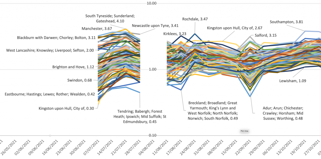
Figure 2: People in 116 areas of England with COVID19: July 2021 to October 2021, %
Source: ONS Coronavirus (COVID-19) Infection Survey, data normally in table 1m when data not missing.
Again ONS did not publish local rates for a few weeks in early August 2021, but started the series up once more towards the end of that month. Now it was smaller northern towns that had the highest rates, with Hull topping the league table for many weeks. Remoter parts of Norfolk and Suffolk had some of the lowest rates at this time; but it eventually rose and fell everywhere. Most importantly, it never fell that much again – anywhere. Only very rarely did fewer than one in one hundred people succumb in any week in any place. During one week in September rates suddenly diverged, up higher where they were already high and down lower where they were already low. I have no idea why. The sample size did not appear to fall.
By the end of this period Southampton headed the table and Lewisham was at the bottom, but the gap between the extremes was much smaller than before, and the overall trend was upwards. The disease was no longer almost disappearing in some places and at some times, it was becoming endemic. Endemic does not mean that the peaks and troughs will end. They almost certainly will continue, just as rates of the endemic common colds wax and wane over time. As yet we are a long way away from any regular pattern emerging.
The final period for which we have data is the most up to date that we have, and overlaps with the last one. Figure 3 shows this latest data and, again, there is a break in the data at one point. I suspect this occurred when ONS wondered if the numbers they were producing during December 2021 could be reliable because they were rising so quickly – doubling or even trebling at times in a week in particular areas as the latest, Omicron, wave arrived.
Figure 3: People in 116 areas of England with COVID19: October 2021 to January 2021, %
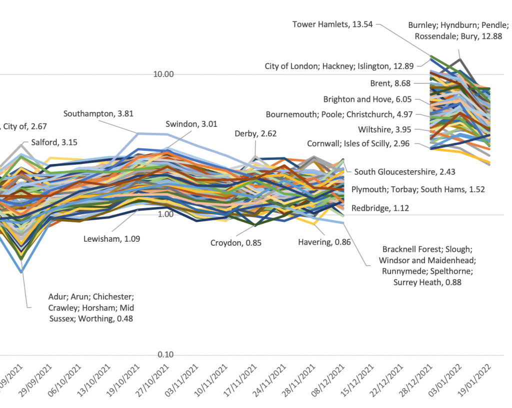
Figure 3: People in 116 areas of England with COVID19: October 2021 to January 2021, %
Source: ONS Coronavirus (COVID-19) Infection Survey, data normally in table 1m when data not missing.
Figure 3 looks to be complex but it actually has a simple message: rates in autumn 2021 were high but flat; then jumped suddenly in December; have fallen slowly in January 2022 but have not fallen that far. It is possible that they may again plateau before again rising during 2022 – we do not know, but a rise does not require a new variant. What we are learning is that levels of this disease rise and fall differently, in different areas, over time, partly as local rates of immunity wane. So far, after each rise abates, it leaves in its wake an ever higher plateau. The lowest rates at the end of Figure 3 were not dissimilar to the highest rates seen at the peak of wave 2, those seen at the start of Figure 1.
What does this all mean for the delivery and planning of public services? Of course, deaths and hospitalizations have fallen greatly; but this disease shows no medium-term signs of going away – from anywhere in England. The story in the rest of the UK is almost certainly very similar, as it is across almost all of the world outside of China and a few other countries. At some point we will start to talk of post-pandemic. At present we are still very much in the midst of the pandemic. As far as the trends over time and space in infections are concerned, we are not, as yet, even on the downwards slope.
For a PDF of this article and the link to the original publication click here.