Visualising the 2020s UK cost-of-living crisis
This article is unusual in that it provides a graphical summary of various aspects of the longer-term crisis that appeared to cumulate in 2022 through to at least early 2024 in terms of especially poor economic and social outcomes for the UK. The article was submitted for consideration in a special issue in the Journal of Social Policy and Administration on diverse perspectives and innovative approaches to addressing the cost of living crisis. This special issues focuses on areas such as financial insecurity, inequalities, food insecurity, food access, policy analysis and the variety of responses there have been. This articles highlights the significant challenges posed by the cost of living crisis in the United Kingdom—the widespread impact on poverty rates, health and well-being, food insecurity, inequality, and social justice. It does so by presenting a series of images that were mostly produced but not used in print to illustrate the book ‘Shattered Nation’ (Dorling, 2023). These 23 images were not included in the book, but most were posted on the book website. A few are more recent.
1 INTRODUCTION
The UK was a remarkably equitable group of countries in the 1960s and early 1970s (Figure 1). Of all large European countries, only Sweden had lower income inequalities at that time, although you would need to look at data for Sweden to confirm that, as well as for many other countries (Dorling, 2017). England, Scotland, Wales and Northern Ireland were all, essential ‘Nordic’ in terms of the gaps between what different groups had to rely on day by day. Wealth inequalities may have been larger, there was still a relic class system with odd British features such as private schools. However, most of those schools only survived though the 1970s and into the 1980s because the state funded what were called ‘assisted places’. That funding came to an end in 1997, but state assistance for private education was not needed after income inequalities rose in the 1980s.

Figure 1: The antecedents of the cost of living crisis. Source: IFS (2024).
The rich could pay their way again. The UK is an international outlier when it comes to just how much money is spent on its private schools. Even the USA spends much less. Only Chile, among all OECD countries, spends nearly as much on such a small proportion of children as regards their secondary education. We will return to Chile and what is currently happening there to deal with the global cost-of-living crisis at the end of this short article.
The huge inequality that the UK lives with in terms from how its children are schooled through to what old age is like for different social groups is only made possible because the UK maintains such high levels of income inequality (Dorling, 2023). This all helps to perpetuate the UK as a state in which children live parallel lives and income inequalities are often justified as apparently giving the most to those who ‘deserve’ the most.
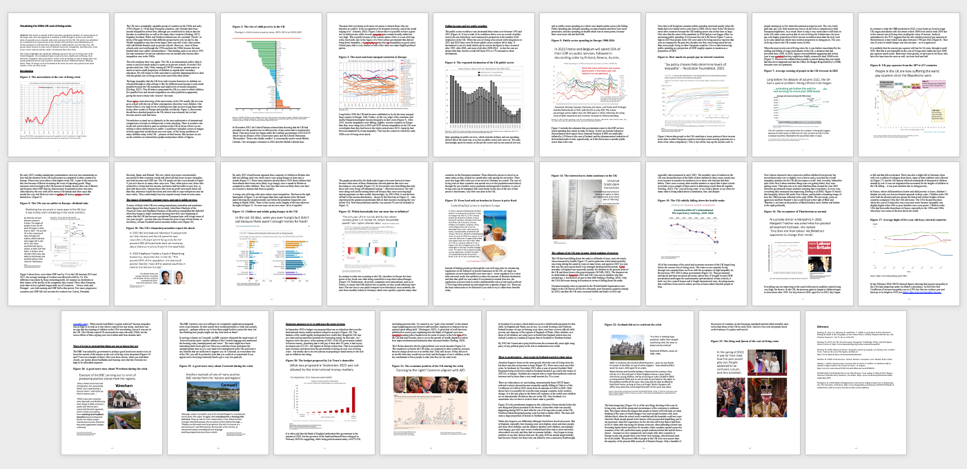
Those seen as most deserving of the most money in the UK usually did not even go to school with the rest of their contemporaries when they were children. One result of this is very high levels of child poverty being suffered in the UK, levels that are now rising faster than in any other country in Europe and possibly faster than in any that is measured in these ways worldwide. Figure 2, shown next, should have shocked people in the UK when it was released; but we had become used to such bad news.
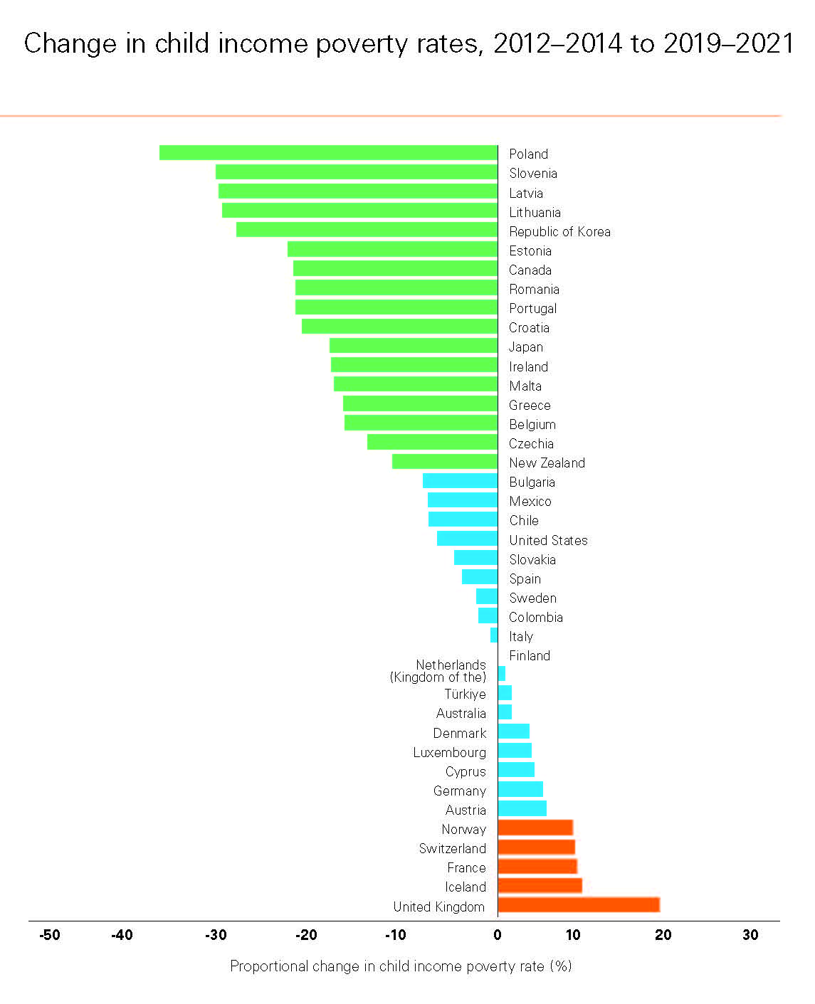
Figure 2: The rise of child poverty in the UK. Source: UNICEF (2023).
Nevertheless, to stand out so distinctly in the most authoritative of international comparisons of trends in child poverty is truly shocking. There is nowhere else in the rich world which is quite as extreme as the UK in terms of how we are willing to allow children here to suffer. I could have included a series of images in these pages that would shock you even more, of the living conditions of many children today in the UK—pictures of their homes. But, because we are social scientists, we instead draw graphs and produce tables of figures. Please note that unlike any of the other states shown to have tolerated increases in child poverty in Figure 2, the UK already tolerated a very high rate of child poverty before the huge increase occured most recently.
In December 2023, the United Nations released data showing that the UK had presided over the greatest rise in child poverty of any nation that it monitored in detail. That most recent rise began under the coalition government of 2010–2015 which was an alliance of the Conservative party and the Liberal Democrats. The moniker ‘Tories who dislike conflict’ is occasionally used to mock British Liberals. One newspaper columnist in 2022 describe British Liberals thus: ‘Because their creed puts such stress on reason, it attracts those who are hopeless at conflict: at the recognition of its frequent necessity, and at the actual waging of it’ (Ganesh, 2022). Figure 2 shows that it is possible to have a great rise in child poverty while income inequality rates remain broadly stable but is also very high. This is partly because of the current nature of the is a cost-of-living-crisis; but mostly due to the legacy of a New Labour government that did not bring down inequality, a Conservative party that sees inequalities as good, and a Liberal party that is very similar to both of the other two main English political parties.
Long before 2010 the UK had become established as by far the most unequal large country in Europe. Only Turkey, on the very edge of the continent, and nearby Bulgaria had higher income inequality in later years (Figure 3). After 2015, income inequalities were falling, slightly, in more countries in Europe than they were rising; but in 2018 and 2019 income inequalities in the UK were even higher than they had been in the whole period since 2010. Austerity had been accompanied by rising inequality. This was the context in which the early 2020s cost of living crisis struck.
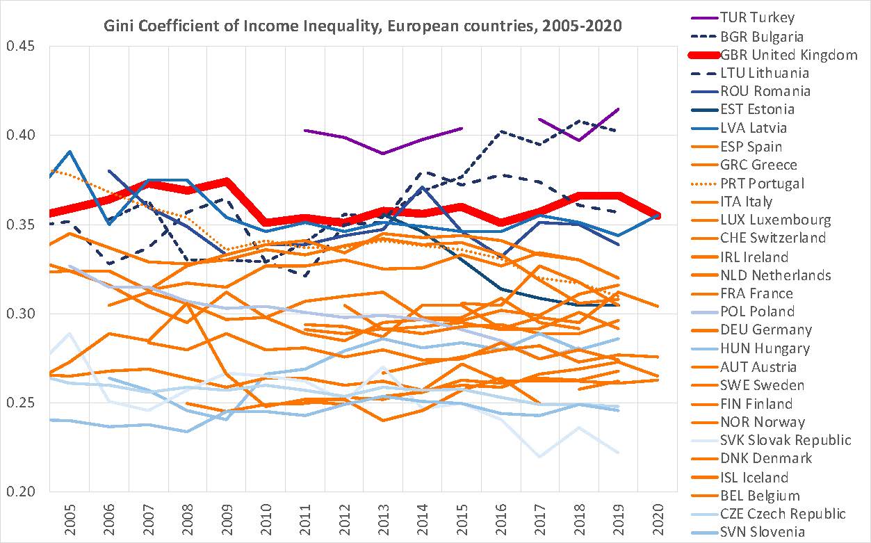
Figure 3:The most and least unequal countries in Europe. Source: OECD income inequality figures as provided in 2023.
2 FALLING INCOMES AND LOW PUBLIC SPENDING
The public sector workforce within the UK was decimated three times over between 1992 and 2021 (Figure 4). The state lost a tenth of its workforce thrice over as a result of public sector job cuts when these were measured in proportion to the number of all employees in the UK. When the cost-of-living crisis struck with rising prices in 2021 and 2022 there were far fewer public sector workers left to help. A decimation is cut of a tenth which can be seen in the figure to have occurred after 1993, after 2005, and most of all after 2009/2014—in fact the cuts are deeper than that, but the overall fall from 23% to 17% amounts to three decimations.
Figure 4: The repeated decimation of the UK public sector. Source: Dorling (2022).
State spending on public services, which includes defence and war spending, did not fall in the same way, or as fast, as public sector jobs were cut. The state increasingly spent its money on the private sector and on out-sourced services and so public sector spending as a whole rose during the period shown in Figure 4, despite public sector jobs falling. Public spending also includes spending on state pensions and there were more pensioners, and it also includes spending on health, which rose at some points, but only because there were more old and frail folk – not due to any actual real improvements in service.
Figure 5 includes the estimates that governments report to the IMF on how much spending they intent to make in future, alongside their past actual record on spending. It does not include Ireland or Switzerland as their reported Gross National Products (GDP) are artificially inflated by US firms in the case of Ireland, and the pharmaceutical industries of Switzerland make it look, superficially, as if the Swiss have a smaller public sector than is the case.
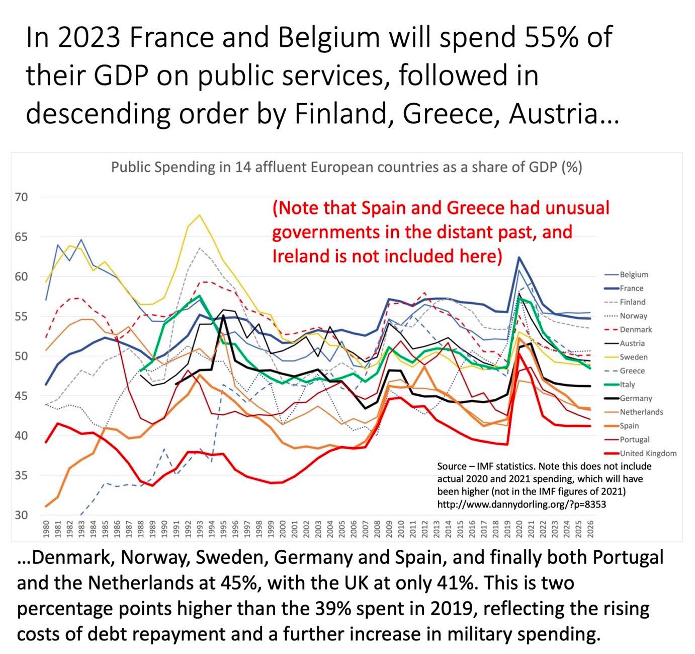
Figure 5: Public sector spending in Europe 1980–2026. Source: Dorling (2021).
Note that in all European countries’ public spending increased greatly when the banks had to be bailed out by each state in 2008; but by more in the UK than in most other countries because the UK banking sector was, at that time, so large. Note also that the onset of the pandemic in 2020 had an even bigger effect on increasing public spending. It is because the red (UK) line in Figure 5 was so high in 2023 that people in the UK were said to be being taxed so much in that year as compared to the past few decades, but they were being taxed far less than were people living in almost all other European countries. Give or take borrowing, public spending as a proportion of GDP roughly equates to taxation as a proportion of GDP…… (paper continues… through to figure number 23)
For the full paper and a link to where it was originally published click here.