Geographical and social Inequalities in health in England across two centuries
In July 2021 the BBC published a series of maps of child mortality in England and Wales in 1850 to compare with maps of Covid-19 mortality rates in 2020-21 and reported that the: ‘pattern of “deeply entrenched” deprivation and ill-health stretches back at least 170 years, according to the chief medical officer for England. “If you had a map of Covid’s biggest effects now and a map of child deaths in 1850, they look remarkably similar,” Prof Chris Whitty told an NHS conference in June. Experts say the problems of crowded housing, insecure work and poor underlying health are echoing down the centuries.’
Almost 180 years ago, in 1842, Edwin Chadwick published his ‘Report on the Sanitary Conditions of the Labouring Population of Great Britain’ which demonstrated that poor sanitation conditions were associated with poor health. Chadwick’s work was so controversial at the time it was published that the Poor Law Committee, which commissioned him to produce the report, disowned him. Nevertheless, his work laid the groundwork for the introduction of the 1848 Public Health Act. This was the key piece of legislation which saw improvements in sanitation designed to tackle the causes of infectious diseases and which resulted in significant improvements in population health for both rich and poor, but especially in urban areas.
Table 1: 1842 Average age of death for occupation group of head of household by geographical location
Location Professionals Tradesmen Labourers
Rutland 52 41 38
Leeds 42 27 19
Liverpool 35 22 15
Manchester 38 20 15
Bolton 34 23 18
Source: https://www.sciencedirect.com/science/article/pii/S0277953617307281
The key table in Edwin Chadwick’s report showed that people in the households of tradesmen lived, on average at least eleven years less than those in the households of people in the professional classes of that day (see Table 1 here). Then, in turn, the average age of death of Labourers was between three and eight years less than that of tradesmen in each city and county. A large part of these differences was due to the different chances of children dying in each social class.
What was most surprising about Chadwick’s finding was that it was not just social class that mattered but also where you lived. 180 years ago infectious diseases mattered so much that Labourers in the rural county of Rutland lived, on average, three years longer than the members of families of the professional classes of Liverpool. Again, deaths among children would have driven these divides, although the inequalities between adult mortality would also have been in the same direction due to exposure to infectious disease.
Three years ago, two colleagues and I updated the key table in Chadwick’s report. What we found was that before the pandemic hit despite life expectancy having nearly doubled since the 1840s, there is still a strong link between where people lived, their social class, and how long they lived. One of my colleagues at the time commented that: “It is remarkable that after 175 years, mortality rates in Liverpool are still higher than in Rutland within each occupational group. What this demonstrates is that living in certain locations offers very different life chances and health outcomes for people within the same occupational groups.”
After almost two centuries had passed the main differences between mortality rates were now between adults aged 16 to 74. Table 2 below shows that a man in a low social class occupation in Manchester in recent years was 22 times more likely to die in the years 2010-2012 than a women of a high social class in Rutland in those same years. This is the most extreme difference in that table.
Table 2: 2012 Relative death rates by occupation of people aged 16-74 by geographical location
Men Women
Location High Mid Low High Mid Low
Rutland 2 3 9 1 2 2
Leeds 6 8 14 3 4 7
Liverpool 6 7 14 3 3 6
Manchester 7 8 22 4 4 7
Bolton 6 6 12 3 4 6
Note: The rates are multiples of the lowest rate for women of high social classes in Rutland who had a mortality rate of 46.1 per 100,000 between aged 16 and 74 in the years 2010 to 2012.
Source: https://www.sciencedirect.com/science/article/pii/S0277953617307281
It is partly because mortality is now so rare before age 74 for better-off women in affluent counties like Rutland, that the relative differences shown in Table 2 are wide. People in Northern English urban areas of all social classes are still more likely to die younger than in Rutland. However, the underlying reasons have changed from infections and infant health, to wealth inequalities determining who can and cannot live in certain areas, alongside increased segregation along housing tenure lines.
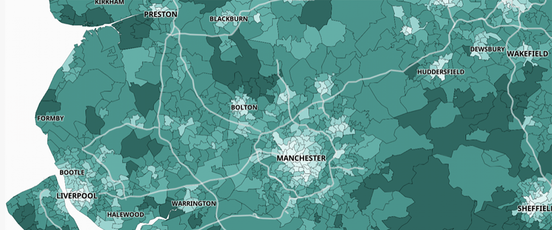
The pandemic of 2020/21 saw a return of infectious diseases as part of the explanation for mortality differences between areas. The final map shown here of part of the North of England is taken from the government Covid-19 dashboard in July 2021. It shows the proportion of adults who had received a second dose of vaccine by July 2021. All the areas in Chadwick’s’ original table are included in this map apart from Rutland which had a second dose vaccine rate of over 90% by the July.
Proportion of adults who had had a second doses of vaccine in Northern England, July 2021

Proportion of adults who had had a second doses of vaccine in Northern England, July 2021
Source: https://coronavirus.data.gov.uk/details/interactive-map/vaccinations
One reason why the centres of the cities stand out in the map is that they contain more younger adults who were vaccinated later and so were not yet eligible for a second dose. However, a part of the reason for this map showing such a distinctive urban/rural pattern is that more people in urban areas are distrustful of the authorities. This is perhaps not surprising after almost two centuries of such persistent inequity. However, it also means that adults in the summer of 2021 are least likely to be vaccinated where overcrowding is greatest; where people cannot afford to leave the city for some country retreat; where people most often have work in jobs that require close contact; and where people are most likely to have poor underlying health as a result of high social inequalities; and where there are the most children.
For the original published article and a PDF click here.