Public Inquiry into rising mortality in England announced

In June 2018 the UK Office for National Statistics (ONS) released data for England that revealed mortality rates to be rising across the country. This rise in mortality rates had occurred even after having taken out the likely impact of population ageing. In other words, more people were dying and that was not because of a greater proportion of people becoming older.
On August 1st 2018 the BBC reported this news under the headline “Why did more people die in the depths of last winter?” and also announced that the Department of Health were still to announce the terms of reference of an official inquiry into the deaths although it is ‘understood they will cover areas like excess winter deaths and deprivation.’ This was not very reassuring given the much longer list of possible causes that had been published almost two months earlier in the Journal of the Royal Society of Medicine.
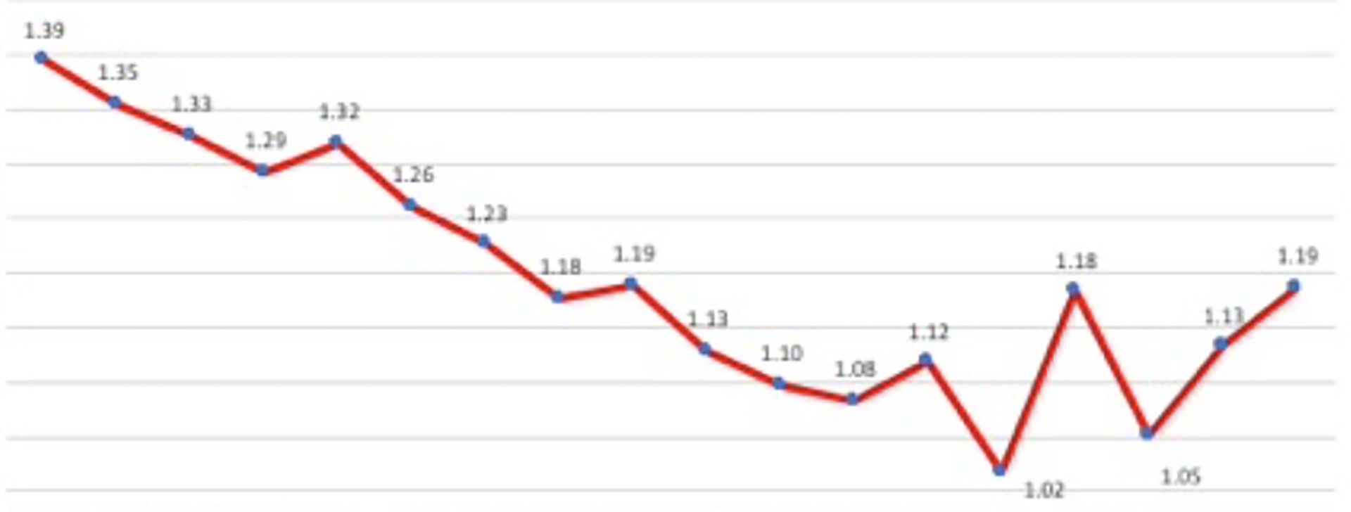
The rise marked the end of a longer period of improvement that had lasted from long before the Second World War through to around 2012. As the figure taken from the ONS report below shows, there had been the occasional very small rise before, as occurred in 2005 and 2009 .

Note: shows proportion of people dying each year in England at quarter 1 rates
Source of graph: ONS
According to the Met Office the winter of Quarter 1 2009 was the coldest since 1995/6 in England and Wales. Partly as a result of the unusual cold there was a slight rise in age-sex standardized mortality between Q1 2008 and Q1 2009. Similarly, in Q1 2005, there was a great deal of snow. More recent winters have been much warmer. There has been no unusually cold winter since at least 2011. The cold does not account for what has happened recently. It did not become very cold until late February in 2018.
The recent rises in mortality rates were also not due to influenza. As the ONS commented in June 2018: ‘influenza activity remained at medium levels throughout the whole of January and February 2018.’ No influenza epidemics have been recorded in any recent year; the rapid rise in mortality in England is not due to influenza.
ONS published analysis in June 2018 that concluded that the change in the mortality trend could be shown to have occurred between 2011 and 2012 for the age groups that were most effected. So we now know when whatever has happened began to happen.
Data is available on the number of deaths that occurred in each area of Britain in Quarter 1 2018 and Quarter 1 2016. This is the period shown in the graph above in which the greatest rise in age-sex adjusted mortality rates occurred most recently. There will also have been changes to the age structure of the population in these areas, but these are likely to be slight. The table below shows the 22 local authority districts in which at least 100 additional people died in the same quarter of 2018 as compared to 2016, and in which there was also at least a 25% rise in mortality rates.
Table 1: The areas of England which experienced the greatest
relative increases in mortality, Q1 2016 to Q1 2018

Increase   <Deaths in three months>
in deaths  Q1 2018   Q1 2016  %rise  District

129       411       282       46%    South Staffordshire
125       419       294       43%    West Lancashire
123       418       295       42%    Preston
143       510       367       39%    Huntingdonshire
182       655       473       38%    Hillingdon
111       402       291       38%    North Kesteven
134       508       374       36%    Suffolk Coastal
117       454       337       35%    Stafford
100       390       290       34%    Gedling
110       431       321       34%    Wycombe
171       687       516       33%    Central Bedfordshire
205       883       678       30%    Stoke-on-Trent
106       460       354       30%    Eastbourne
126       564       438       29%    South Tyneside
109       489       380       29%    Waveney
123       557       434       28%    Wealden
115       546       431       27%    Harrogate
135       642       507       27%    Bexley
100       476       376       27%    Chichester
182       873       691       26%    Wolverhampton
116       558       442       26%    Northampton
104       512       408       25%    Redcar and Cleveland
Source: ONS
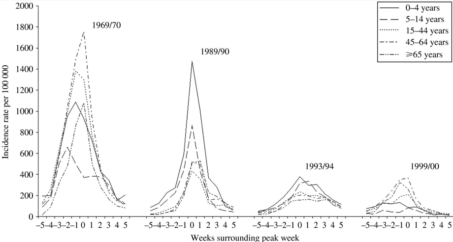
The diagram below shows what the pattern of an influenza epidemic looks like in terms of severity and duration based on the epidemics that did take place in England in the winters of 1969/70, 1989/90, 1993/94 and 1999/2000. If we were to suffer an influenza epidemic this is the most likely pattern in terms of severity rising rapidly over the course of less than five weeks and then falling equally rapidly again. An influenza epidemic (in winter 2018/2019 say) on top of what has already been happening would be devastating.
The weekly incidence of Influenza-like illness (ILI) by age for a selection of the more severe epidemics over the last 40 years. Age-specific rates are for the weeks surrounding the peak week of all-age incidence (week 0)

Typical length of time and severity of influenza epidemics in England, 1960-2000
Source: Fleming, D.M. and Elliot, A.J. (2008) ‘Lessons from 40 years’ surveillance of influenza in England and Wales. Epidemiology and Infection, 136, 866-875.
By larger geographic area the greatest absolute and relative rise has been in the county of Lancashire. The table below shows in which counties and regions of England and Wales the rise has been the greatest where at least an additional 100 deaths occurred.
It is worth noting that the rise tends to be lower in areas with fewer older people, such as Inner London and some of the Northern Metropolitan Counties. The overall rise was 16% in England, an additional 20,907 deaths in the first three months of 2018 as compared to the first three months of 2016.
Table 2: The Regions England and Wales, sorted by increases
in mortality Q1 2016 to Q1 2018

Increase  <Deaths in three months>
in deaths   Q1 2018   Q1 2016    %rise  Region/County

   726         4030     33,04    22%    Lancashire (County)
 2,259       13,992    11,733    19%    EAST MIDLANDS
 2,738       17,399    14,661    19%    WEST MIDLANDS
 2,788       17,825    15,037    19%    EAST
 3,519       25,105    21,586    16%    SOUTH EAST
20,907      153,635   132,728    16%    ENGLAND
 1,395       10,502     9,107    15%    WALES
 2,839       21,987    19,148    15%    NORTH WEST
 1,100        8,662     7,562    15%    NORTH EAST
 2,012      16,066     14,054    14%    YORKSHIRE AND THE HUMBER
 2,113       17,651    15,538    14%    SOUTH WEST
   732       6,289      5,557    13%    West Yorkshire (Met County)
   859       7,411      6,552    13%    Greater Manchester (Met County)
   483       4,571      4,088    12%    Merseyside (Met County)
 1,539      14,948     13,409    11%    LONDON
   392       4,637      4,245     9%    Inner London

Source: ONS
The table above is from the same source and shows mortality numbers rose the most in the Midlands Regions (just below Lancashire’s slightly higher relative rise). Incidentally, rises tended to be higher in areas that mostly strongly voted Leave in the 2016 referendum. Mortality rose by national average rates in the North West; but much more in more rural and older (aged) Lancashire than in urban Merseyside. The rates rose the least in London, especially inner London. Inner London has the highest proportion of migrants from overseas.
The inquiry will have its’ work cut out explaining why middle Britain was so badly hit and why almost all of England also suffered so much. The final table below shows the few areas of England which experienced a fall in mortality between these two years. A fall is what would normally be expected everywhere, and a larger fall than the very small reductions in some of the areas listed below. Finally, note that the City of London, Oxford, Kensington and Chelsea, and a tiny number of other southern boroughs and towns appeared to be the only areas of England to be almost entirely unaffected by what has just occurred and is presumably still occurring throughout 2018 and into 2019.
Table 3: The few areas of England with a
fall in mortality Q1 2016 to Q1 2018

Increase Deaths in three months
in deaths Q1 2018 Q1 2016 % rise District

  -1       192       193      -1%    South Bucks
  -3       496       499      -1%    Milton Keynes
  -2       180       182      -1%    Tamworth
  -4       352       356      -1%    Fareham
 -14       326       340      -4%    Haringey
 -24       444       468      -5%    Colchester
 -28       446       474      -6%    Bath and North East Somerset
 -20       298       318      -6%    Hackney
 -11       160       171      -6%    Epsom and Ewell
 -18       252       270      -7%    Oxford
  -1        11        12      -8%    City of London
 -27       209       236     -11%    Kensington and Chelsea
  -2         6         8     -25%    Isles of Scilly

Source: ONS
Read a pdf of original article here.
And a link to the July/August issue of Public Sector Focus it was published can be found here.