Peak Injustice Figures and Tables

Book Cover: The cover is red and black, as is traditional. A little green could have been added, maybe in a future edition.

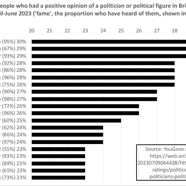
1.1 Approval ratings for leading politicians in the UK, April–June 2023

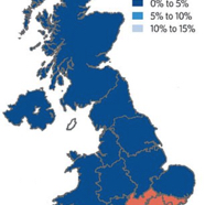
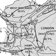
1.2 Annual house price change by region in the UK, year to Q3 2019

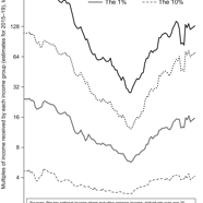
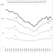
1.3 Income inequality 1910–2019, UK

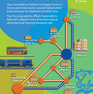
1.4 The Brexit Way, a walk around southern England mostly in Brexit-land

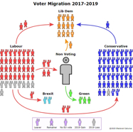
1.5 Migration of voters from 2017 to 2019, by 2016 referendum choice

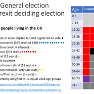
1.6 Disaggregation of the population of the UK in 2019, by age and vote

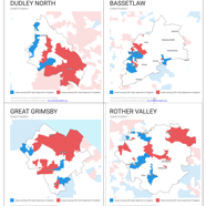
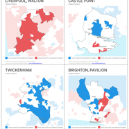
1.7 Areas of high and low poverty in four significant seats in the 2019 general election

1.8 Areas where Labour, the Conservatives, the Liberal Democrats and the Greens do best

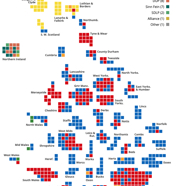
1.9 The 2019 political map of the UK, drawn by the House of Commons

1.10 Liz Truss brought her plans to the Commons on Thursday

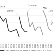
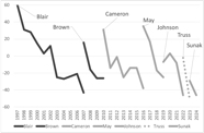
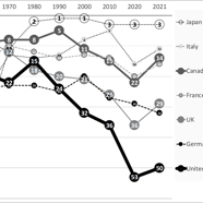
1.11 Net satisfaction rating of British prime ministers, 1997–2024 (%)

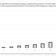
1.12 IPPR estimates of the Truss/Kwarteng budget effects, had it been implemented

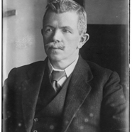
1.13 John Robert Clynes (1869–1949), leader of the Labour Party (1921–22)

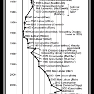
1.14 Political polarisation, 1920–2017

1.15 Edward, then Prince of Wales, visits mining families in County Durham in 1929

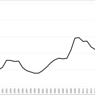
1.16 UK income inequality 1910–2019

1.17 Economic policies of almost all political parties in the world compared, left to right

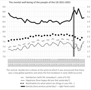
2.1 A worthwhile life, satisfaction, happiness and anxiety, UK, 2011–21

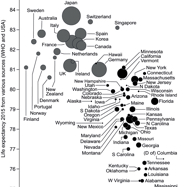
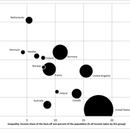
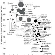
2.2 Take of the 1 per cent in 1983 and later versus life expectancy in 2015, in 19 countries and all US states

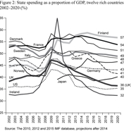
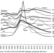
2.3 State spending as a proportion of GDP, 12 rich countries 2002–20 (%)

2.4 Proportion of people walking or cycling as their main means of travel

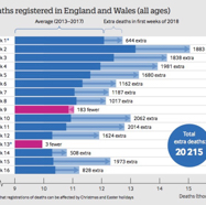
2.5 The rise in mortality in England and Wales in the first 16 weeks of 2018

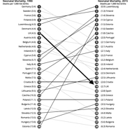
2.6 Neonatal mortality rates, EU countries, 1990–2015

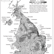
2.7 The human geography of the EU referendum vote, 2016

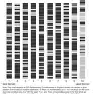
2.8 Decile of deprivation and the 2016 EU referendum, England

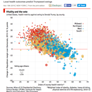
2.9 Local health outcomes predict Trumpward swings, 19 November 2016

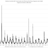
2.10 Weekly mortality and influenza-like illnesses, England and Wales, 1999–2016

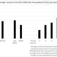
2.11 The amount of money people had to live on in the UK in May 2020

2.12 1950s, girl on a carousel ride at a fairground, England, UK

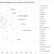
2.13 Average levels of happiness and inequality for all countries with data, 2023

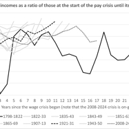
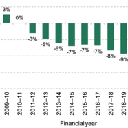
2.14 The worst squeeze on pay for over 200 years

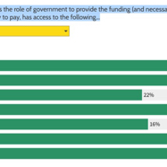
2.15 Fairness Foundation survey of 2,052 people in the UK: 22–23 March 2023

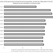
2.16 A majority of people with incomes of £150,000+ don’t worry much about others

2.17 Cumulative real-terms pay changes for FE staff relative to 2010–11, 2007–23

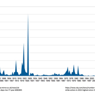
2.18 Numbers of days lost per year due to strikes in Britain, 1892–2022

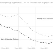
3.1 Sleeping rough in Scotland and seeking assistance, April 2002 to March 2020

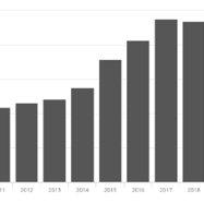
3.2 Sleeping rough in England as counted on a single night in autumn, 2010–20

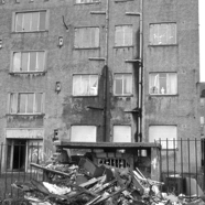
3.3 Grenfell Tower, Notting Dale, Kensington during the 14 June 2017 fire

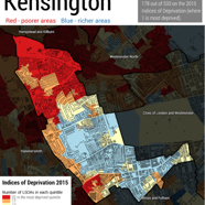
3.4 Neighbourhoods in Kensington coloured by their poverty rate, 2015

3.5 The child in the window: health and housing, a lasting relationship

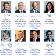
3.6 Signatories to the Joint Ministerial Foreword to Command Paper 713

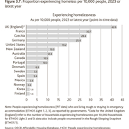
3.7 Proportion experiencing homeless per 10,000 people, 2023 or latest year

3.8 State spending as a proportion of GDP, 12 rich countries 2002–20 (%)

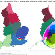
3.9 England, sized by the numbers of people accused of riot in 2011

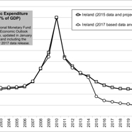
3.10 Ireland: public expenditure as a proportion (%) of GDP, 2001–22

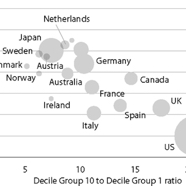
3.11 Economic inequality and the maths ability of young adults up to age 24, 2012

3.12 One of the two Cutteslowe walls dividing streets in Oxford from 1934 to 1959

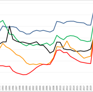
3.13 Public spending in the UK as a share of GDP (%), 1980–2019, projected to 2026

3.14 Public spending in the five most populous European countries as share of GDP (%), 1980–2019, projected to 2026

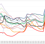
3.15 Public spending in 14 affluent European countries as share of GDP (%), 1980–2019, projected to 2026

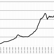
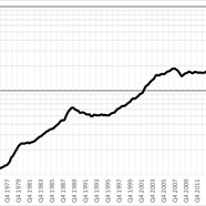
3.16 Nationwide Building Society UK house price series 1973–2021 (£s, nominal scale)

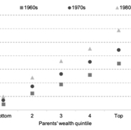
3.17 Median inheritance as a percentage of lifetime net income (excluding inheritance)

3.18 Nationwide Building Society UK house price series 1973–2021 (£s, log scale)

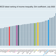
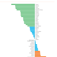
3.19 The ranking of rich countries by their levels of income inequality in 2022

3.20 Take of the 1 per cent in 1983 and later versus life expectancy in 2015, in 19 countries and all US states

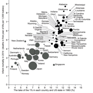
3.21 Inequality and infant mortality, 19 affluent countries and all US states

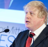
3.22 Boris Johnson displaying his ‘top cornflake’ thinking-deeply face

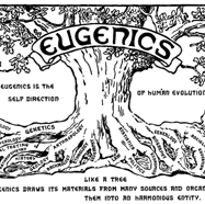
4.1 Logo of the Second International Congress of Eugenics, 1921

4.2 Social and educational mobility and income inequality, early 2000s

4.3 Adults objecting to having an Asian or West Indian in-law, UK 1983–2013 (%)

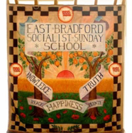
4.4 Banner of the East Bradford Socialist Sunday School, Fred Liles, 1914

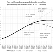
4.5 The global population has doubled in the past 47 years

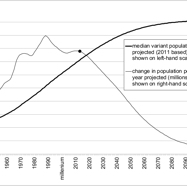
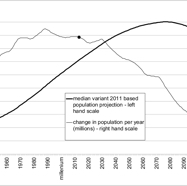
4.6 UN world population estimates and projections published in 2011

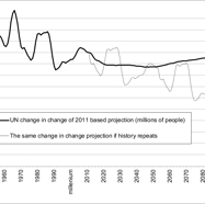
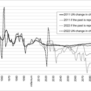
4.7 UN and alternative change-in-change estimates and projections published in 2011

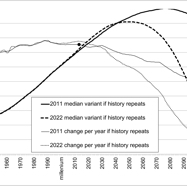
4.8 Alternative world population estimates and projections published in 2011

4.9 UN world population estimates and projections published in 2011 and 2022

4.10 UN and alternative change-in-change estimates and projections, 2011 and 2022

4.11 Alternative world population estimates and projections published in 2011 and 2022

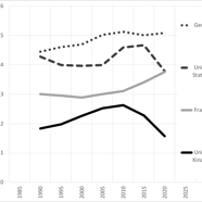
5.1 The average height of five-year-old boys in four affluent states, 1990–2020

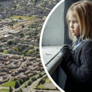
5.2 Press image, blue-eyed blonde-haired girl modelling child poverty, 2023

5.3 The United Nations International Children’s Emergency Fund 2023 Report

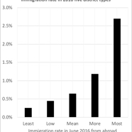
5.4 England split into five areas by 2016 immigration rate (% in the year)

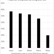
5.5 Voters who voted Leave in 2016, by 2016 immigration rate, England (%)

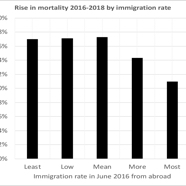
5.6 Increase in death rates 2016–18, by 2016 immigration rate, England (%)

5.7 Women’s rise in life expectancy per year in weeks, 2010–16, affluent countries

5.8 Men’s rise in life expectancy per year in weeks, 2010–16, affluent countries

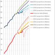
5.9 The first four revisions of official UK life expectancy projections, 2012–20

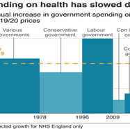
5.10 How spending on health has slowed down in the UK, 1955–2022

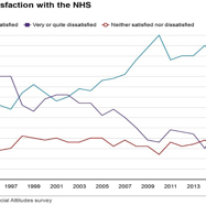
5.11 Levels of patient satisfaction with the NHS in Great Britain, 1993–2018

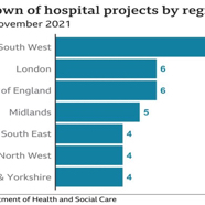
5.12 The geographical distribution of the 40 new hospitals promised for England

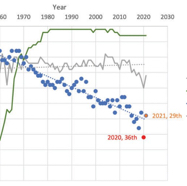
5.13 UK ranking in international life expectancy league tables, 1950–2021

5.14 International life expectancy rankings, countries of the G7, 1950–2021

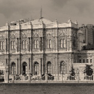
5.15 Dolmabahçe Palace in Istanbul: the ‘nerve centre of the Ottoman Empire’

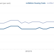
6.1 Income inequality in the UK 2002–22, before and after housing costs

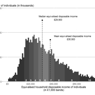
6.2 Distribution of UK household disposable income, financial year ending 2020

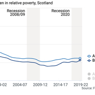
6.3 Child poverty in Scotland 1994–2022, before and after housing costs

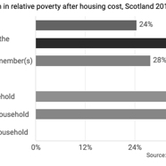
6.4 Child poverty in Scotland, by type of household and family, 2019–22

6.5 The sunlit uplands, a view near one of Rishi Sunak’s many homes

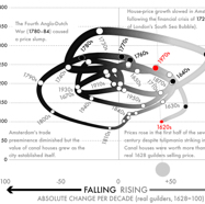
6.6 The Herengracht Index (the Dutch house-price index of Amsterdam), 1620s to 1970s

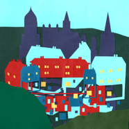
6.7 The spires, homes, windows and walls – Oxford, by Isabella Lill, 2020

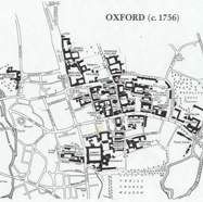
6.8 The colleges of Oxford and the streets and rivers of the city around the year 1756

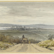
6.9 View of Oxford from Shotover Hill in flood-time, when the water was over the bank

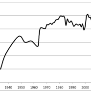
6.10 State-school undergraduates admitted to the University of Oxford, 1927–2018 (%)

6.11 City Council suggestions for where those working in Oxford might live, 2019

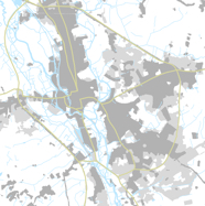
6.12 The rivers, canal, roads, lakes and buildings of Oxford, 1939–45 and 2013

6.13 Finland topped UN’s World Happiness Report again: a Helsinki view

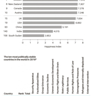
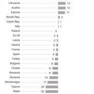
6.14 The happiest and most stable countries in the world, 2016–19

6.15 Trust in journalism, 2015–16, leading countries – the net trust index rankings

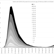
7.1 Deaths per week by age due to the pandemic, wave 1 in England and Wales

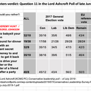
Table 1 The voters’ verdict: Question 11 in the Lord Ashcroft Poll of late June 2019 (%)

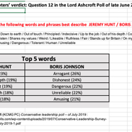
Table 2 The voters’ verdict: Question 12 in the Lord Ashcroft Poll of late June 2019

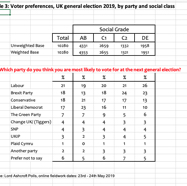
Table 3 Voter preferences, UK general election 2019, by party and social class

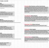
Table 4 The housing news on Tuesday, 1 June 2021

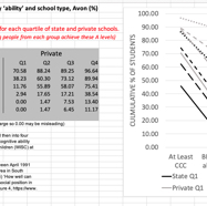
Table 5 Children awarded A level grades or equivalent by ‘ability’ and school type, Avon (%)

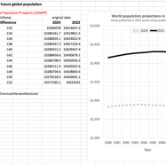
Table 6 UN projections for future global population
