
FIGURES
Figure 1: The seven children among all 100 children (p14)
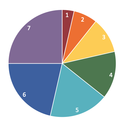
Figure 2: The shares of the typical seven children (p15)
Figure 3: Income inequality in the UK, 1961–2022 (p35)
Figure 4: Average height of 5-year-old boys, countries, 1985–2020 (p50)
Figure 5: Wage squeezes in the UK, 1900–2FI024 (p85)
Figure 6: Income shares of and within the top 10%, UK, 1910–2022 (p145)
Figure 7: Voting at the UK general election, 2019 (p163)
Figure 8: Change in child poverty, countries, 2012–14 to 2019–21(p172)
Figure 9: Well-being in the UK, 2011–21 (p198)
Figure 1:
The seven children among all 100 children, page 14
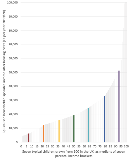
Note: Area is proportional to disposable family daily income in Britain in the 2020s. The 6 per cent of children who are better off than the seventh child live in families that receive 34 per cent of all annual income, and are not included here. The families of our seven typical children are thus only sharing 66 per cent of the overall UK disposable household income pie (see the book’s Appendix).
Figure 2:
The shares of the typical seven children, page 15
Source: UNICEF Innocenti—Global Office of Research and Foresight (2023) ‘Innocenti Report Card 18: Child poverty in the midst of wealth’, UNICEF Innocenti, Florence, December, https://www.unicef.org/globalinsight/media/3291/file/UNICEF-Innocenti-Report-Card-18-Child-Poverty-Amidst-Wealth-2023.pdf
Note: UNICEF report the relative percentage change shown here, not the percentage point change.
DOWNLOAD FIGURE 2Figure 3:
UK income inequality, 1961–2022, page 35
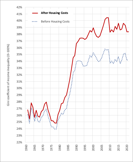
Source: IFS (2024) ‘Living standards, poverty and inequality in the UK’, Institute for Fiscal Studies, https://ifs.org.uk/living-standards-poverty-and-inequality-uk (accessed 11 January 2024).
Note: Among all households, calculated as the Gini coefficient.
DOWNLOAD FIGURE 3Figure 4:
Average height of 5-year-old boys, countries, 1985–2020, page 50
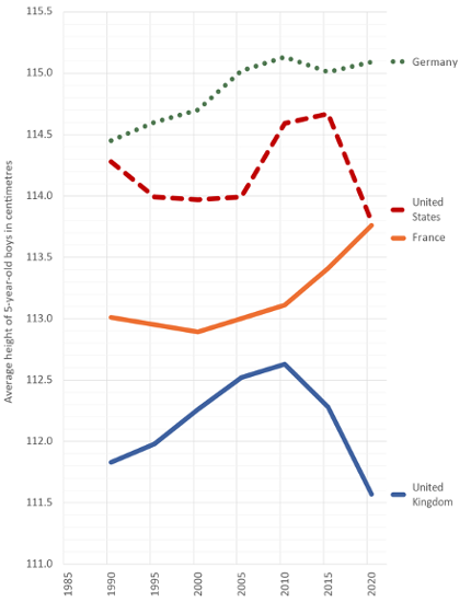
Source: Redrawn by the author from data in Press Association (2023) ‘British children shorter than other five-year-olds in Europe’, ITV News, 21 June, data available at https://www.itv.com/news/2023–06–21/british-children-shorter-thanother-five-year-olds-in-europe
Note: A 5-year-old in 1990 would have been born in 1985 and their height influenced mostly by nutrition in the years 1985–1990.
DOWNLOAD FIGURE 4Figure 5:
Wage squeezes in the UK, 1900–2FI024, page 85
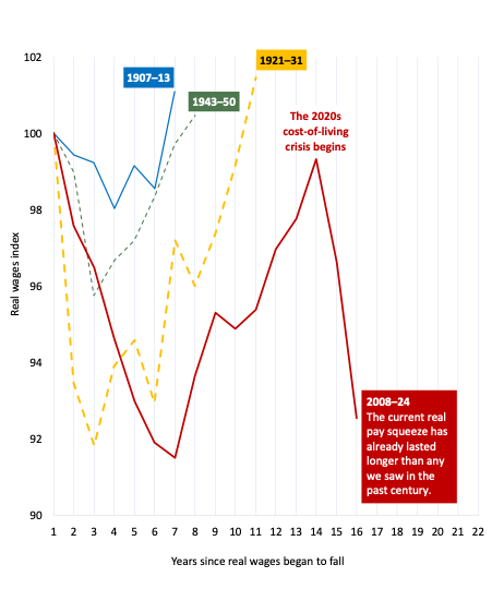
Source: Redrawn by the author from updated data provided by the Trades Union Congress, originally used in Geoff Tily (2018) ‘17-year wage squeeze the worst in two hundred years: Never mind the Great Depression, we’re now experiencing the longest pay squeeze since Napoleon marched across Europe’, TUC, 11 May, https://www.tuc.org.uk/blogs/17-year-wage-squeeze-worst-two-hundred-years.
Note: The graphic shows how the current UK wage squeeze compares to the previous ones that occurred during the last century. This one has gone on for far longer.
DOWNLOAD FIGURE 5Figure 6:
Income shares of and within the top 10%, UK, 1910–2022, page 145
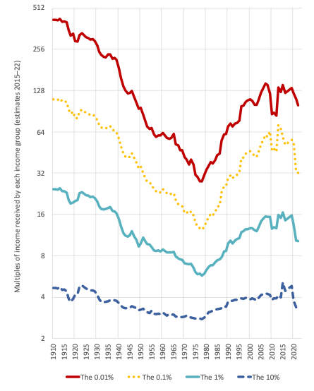
Source: Danny Dorling (2019) Inequality and the 1%, 3rd edition, London: Verso. Data available here: https://www.dannydorling.org/books/onepercent/Material. html—with estimates for 2020, 2021 and 2022 added from the World Inequality Database, accessed 19 April 2024: https://wid.world/country/united-kingdom/
Note: The World Inequality Database estimates suggest a recent fall in income inequality. It will be some years before we can be sure if this occurred or not.
DOWNLOAD FIGURE 6Figure 7:
Voting at the UK general election, 2019, page 163
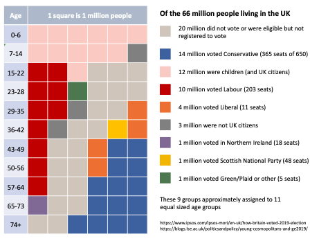
Source: James Sloam and Matt Henn (2019) ‘Young cosmopolitans and the deepening of the intergenerational divide following the 2019 general election’, LSE Blogs, 13 December, https://blogs.lse.ac.uk/politicsandpolicy/young-cosmopolitans-and-ge2019/ and Gideon Skinner and Roger Mortimore (2019) ‘How Britain voted in the 2019 election’, Ipsos, 20 December, https://www.ipsos.com/en-uk/how-britainvoted- 2019-election Note: Voting by major political party and age, approximated to groups of 1 million people. The lightest grey and the darker grey coloured squares represent people who chose not to vote or who were not allowed to vote.
DOWNLOAD FIGURE 7UPDATED Figure 7:
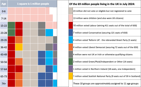
Voting at the UK general election, 2019, page 163
-
Notes for Updated Figure 7
Open or CloseThe age groups no longer contain almost exactly the same numbers of people. People in the UK have had fewer babies in the past five years and so the age group 0–6 now has only around 5.5 million members, not 6 million. However, a little net positive immigration and some ageing means that the older age groups all tend to now contain 6.5 million people rather than 6 million. This is not the case for the age group 23–28, a great many of whom left during the pandemic and, because of Brexit, and never came back. Similarly, the age group 65–73 has not grown in size because of few births after the post-World War Two baby boom (they were born later, in the 1950s). Overall, though, there has been less emigration of families with children – emigration became harder after Brexit. The UK adult population has grown by two million, and most of that is of people aged over 29. This is because of ageing combined with less emigration. But what is most interesting in the update of Figure 7 is not our changing demographics, but how our voting patterns have changed .The greatest change is that three million fewer people chose to vote in 2024 as compared to 2019. There was a huge growth in apathy. In every single age group, apart from people aged 65+, more adults chose not to vote than to vote for any political party. At age 65+ a majority still chose to vote for the Conservatives, but that was a depleted majority. The Conservatives lost to apathy, and to a new alternative being offered to them – the far-far right ‘Reform UK’. The Labour vote actually fell between 2019 and 2024. It fell most amongst the young. What made the 2024 election abnormal was the rebranded Brexit Party standing as ‘Reform UK’ in almost every seat in the mainland of the UK. This party took almost 4 million votes, mainly from the Tories, who lost another 3 million to people no longer voting (net). The result was to hand Labour a 411-seat majority – despite Labour wining fewer votes than it had in 2019! The Liberal Democrat vote was also slightly lower in 2024. To the nearest million, the LibDems won as many votes in 2024 as they had in 2019; but now were rewarded with 72 seats rather than just 11. That is how the UK voting system works. It would be wrong to label the UK a ‘democracy’, as there is such weak relationship between votes and seats.
Sources: IPSOS estimates of voters turnout and voting by age: Gideon Skinner, Keiran Pedley, Cameron Garrett, Ben Roff Public Affairs (2024) How Britain voted in the 2024 election, London: Ipsos, https://www.ipsos.com/en-uk/how-britain-voted-in-the-2024-election Note that this is based on a survey of ‘17,394 GB adults aged 18+, of whom 15,206 said they voted, interviewed on the online random probability Ipsos Knowledge Panel between 5-8 July 2024. The data was weighted using our normal methodology to be representative of the adult population profile of Great Britain, and then the proportions of voters for each party and non-voters were weighted to the actual results by region.’ IPPR research helped confirm the Ipsos findings: Parth Patel and Viktor Valgarðsson (2024) Half of us: Turnout patterns at the 2024 general election, London: IPPR, July, https://ippr-org.files.svdcdn.com/production/Downloads/Half_of_us_July24_2024-07-12-105904_eioz.pdf
Table: proportion of people in each of 6 age groups by UK vote in 2024
%
18-24 25-34 35-44 45-54 55-64 65+ Not voting 63 59 52 45 36 27 Labour 15 19 20 20 20 17 Conservative 2 4 8 12 17 32 Liberal Dem. 6 5 6 8 8 9 Reform UK 3 5 7 9 12 10 Green Party 7 5 3 3 3 1 SNP/Plaid 2 1 2 1 2 3 Other 2 2 2 2 2 1 Total 100 100 100 100 100 100
Source: Ipsos survey held 5-8 July 2024 and weighted to fit regional totals.
The figures in the table above were used alongside the overall party vote totals and population estimates to revise Seven Children’s original Figure 7, based on 2019, into its 2024 form. The ONS estimate population of the UK in mid-year 2024 was 69.025 million – so three million more than what we thought the population was in 2019. Of those, 28.809 million people voted.
See: Richard Cracknell and Carl Baker (2024) General election 2024 results , Research Briefing, London: House of Commons Library, 18 July, https://researchbriefings.files.parliament.uk/documents/CBP-10009/CBP-10009.pdf
Those voting in the 2024 general election were just 59.8% of the 48 million people registered to vote. So, to the nearest million, 40 million people did not vote or were not registered to vote. Of that 40 million, 14 million were children, leaving 26 million adults who did not vote. Of those adults who did not vote, 20 million chose not to vote, and another 6 million were not registered to vote or were not permitted to register to vote. It is not easy to determine who exactly qualifies to vote in the UK because of complex rules about residency.
The number was 7 million of people able to but not registered to vote in England and Wales in April 2024, roughly a million extra appeared to have registered before the election took place in July. See: Craig Westwood (2024) Millions of missing voters urged to register before deadline, London: The Electoral Commission, 9 April, https://www.electoralcommission.org.uk/media-centre/millions-missing-voters-urged-register-deadline
The final table here shown below is of the population change in the UK by age, for those readers who are interested in what has happened and where we are heading in terms of how many of us there are, and who will be voting at the next General Election.
The first column in Table 2 shows how each population group has changed in size compared to five years earlier. Thus, there are 1% fewer children aged 5–9 in the UK in 2024 than the numbers aged 0–4 in 2019. Deaths and net migration are the only possible reasons. The age group that has grown the most are those aged 20–24 in 2024, by 16%; that has to be due to net in-migration. If you follow down the first column of figures in Table 2, you will note that the first fall is for ages 55–59. This is when deaths begin to take their toll. Follow the column down to its end and you will see that 88% of those aged 95–99 in 2019 did not make it to be 100+ in 2024.
The second column in Table 2 is the absolute number of people, in thousands, that the percentages in the first column refer to. The third and fourth columns are the ONS estimates and projections for the population of the UK by age in 2019 and 2024. Note that the total population estimate for 2019 is now thought to have been 66.8 million (nearer to 67). The fifth and sixth columns are the change when we just compare the age groups directly. There were 366,000 fewer children aged 0–4 in the UK in 2024 than in 2019, a 9% fall. This is greater than the 8% fall in the numbers aged 5–9 in 2024. Our primary schools are going to struggle to fill places in future, and then our secondary schools. We will be an even older population at the time of the next General Election, despite the continued immigration that the UK benefits from. The final row in Table 2 shows that we grew in total population size by 3% in these five years. Without immigration we would already be a shrinking island. And, already, the 25–29 age group are fewer in number than those who were of those ages in 2019. Our future will depend as much on who comes and who goes, as on how we vote, and whether we ever manage to make voting fair.
Table: Population estimates and projections by the Office for National Statistics, United Kingdom (UK), PERSONS, thousands, 2019, 2024, and change by age group
cohort basis
populations period basis ages change %
absolute 2019 2024 change % absolute 0-4 3,854
3,519 -9% -336 5-9 -1% -24 4,153 3,831 -8% -322 10-14 -1% -59 3,956 4,094 3% 137 15-19 3% 113 3,653 4,069 11% 416 20-24 16% 586 4,155 4,238 2% 83 25-29 8% 344 4,525 4,499 -1% -27 30-34 7% 318 4,505 4,843 8% 338 35-39 6% 281 4,402 4,786 9% 384 40-44 3% 119 4,021 4,520 12% 499 45-49 2% 75 4,405 4,097 -7% -309 50-54 1% 30 4,662 4,435 -5% -226 55-59 -1% -32 4,408 4,630 5% 222 60-64 -3% -111 3,758 4,297 14% 538 65-69 -5% -182 3,371 3,577 6% 205 70-74 -8% -272 3,320 3,100 -7% -220 75-79 -13% -421 2,327 2,899 25% 572 80-84 -21% -484 1,716 1,842 7% 126 85-89 -35% -594 1,041 1,122 8% 81 90-94 -53% -554 459 487 6% 28 95-99 -73% -333 128 126 -2% -2 100 & over -88% -112 13 16 21% 3 all ages
3% 2,192 66,833 69,025 3% 2,192
Source: ONS Principal projections 2024, and 2018-based projections for 2019.
Figure 8:
Change in child poverty, countries, 2012–14 to 2019–21, page 172
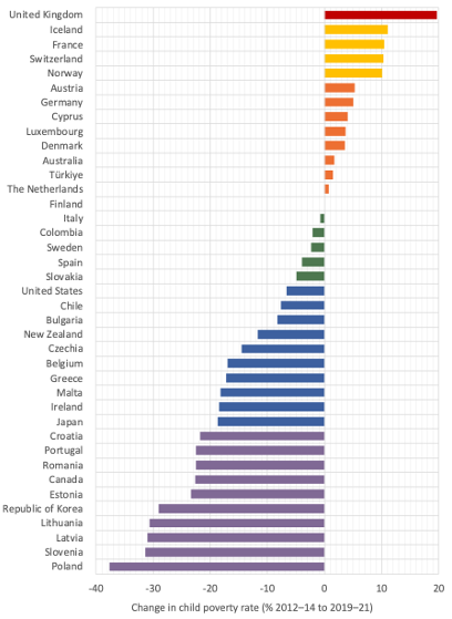
Source: UNICEF Innocenti—Global Office of Research and Foresight (2023) ‘Innocenti Report Card 18: Child poverty in the midst of wealth’, UNICEF Innocenti, Florence, December, https://www.unicef.org/globalinsight/media/3291/file/UNICEF-Innocenti-Report-Card-18-Child-Poverty-Amidst-Wealth-2023.pdf
Note: UNICEF report the relative percentage change shown here, not the percentage point change.
DOWNLOAD FIGURE 8Figure 9:
Well-being in the UK, 2011–21, page 198
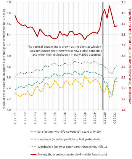
Source: David Finch and Adam Tinson (2022) ‘The continuing impact of COVID-19 on health and inequalities: A year on from our COVID-19 impact inquiry’, The Health Foundation, 24 August, https://www.health.org.uk/publications/longreads/the-continuing-impact-of-covid-19-on-health-and-inequalities
Note: These estimates are the official measures of mental well-being of the people of the UK, as reported by the ONS for each quarter of the years 2011–21.
DOWNLOAD FIGURE 9Figure 10:
Children dying in England, 2020–23, page 209
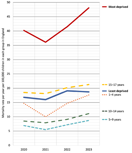
Source: NCMD (2023) ‘Child death review data release: Year ending 31 March 2023’, National Child Mortality Database, release of 9 November, https://www.ncmd.info/publications/child-death-data-2023/
Note: These figures are the mortality rates of children in England by age and neighbourhood deprivation, 2020–23.
DOWNLOAD FIGURE 10Figure 11:
Income inequality, countries, 2005–20, page 216
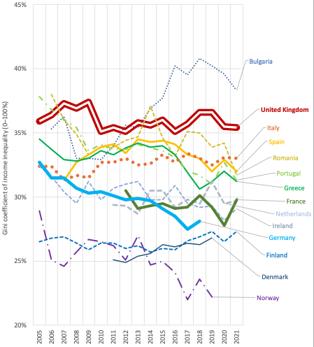
Source: OECD ‘Income inequality’, https://data.oecd.org/inequality/income-inequality.htm
Note: These are the latest OECD measures of income inequality in fourteen European countries (May 2024).
DOWNLOAD FIGURE 11


