The Population of the UK


Published by Sage

Downloads


Related material for Chapter 10
All available data and further material can be found in the Data section.
Exercise
Mapping the population of the world is far more difficult than charting it within one rich nation for which there is abundant information. National censuses are often not taken in many countries, so the results of surveys can be hard to compare. Most importantly of all, international statistics are almost always presented for states which vary enormously in population and for which averages tend to disguise huge internal variations.
The surveys which were used to generate the figures used to shade the maps in this chapter did differentiate almost universally between children living in rural or urban settlements and that alone showed that the worst conditions were concentrated out of the cities. Why else would so many people in poor countries be leaving the land for the cities?
One day soon maps will be drawn of the entire world’s population that will differentiate both within countries as well as between them. The map base used here is the very first that could do this, but only if we had data for within country distributions as well as between country variations. Such maps will depict an even more starkly divided world than that shown in these pages on which, after all, the maps only depict up to 45 statistics. Suppose we had information on every square of the world cartogram, on the living conditions of every geographical concentration of 1 million children in the world. The maps would still be presenting averages of huge numbers of people, but for 2,150 regions rather than just 45 countries. How might such a map look?
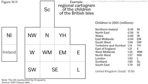
To begin, draw an example of how a new world map might appear for the 14 million children of the United Kingdom. First you need to draw your base map. You could use the outline drawn in the world maps in this book, or a simpler one in which the Kingdom is allocated 14 squares on the map in a shape which very roughly approximates its boundaries. A rough example is provided in Figure 10.11 (see above) where the regions and countries of the Kingdom have each been allocated a square, the South East and Scotland, both with the largest numbers of children, being allocated two squares. You need not use this example. Instead you could combine groups of six or seven of the European constituencies used in this book. One year’s worth of their children are counted in Figure 1.3 of this book.
Next, each choose one example from this book of a variable for your 14 areas. Remember that as each of the areas used in this book contain roughly equal populations, in most cases you can simply sum proportions shown on these maps and divide them by the number of areas you are considering to calculate an average proportion which is representative of that group as a whole. Having drawn your map, next compare it to the original map of variation over 84 or 85 areas. How much of the original detail do you lose? The answer to that question depends on how much variation within regions there was to begin with.
A good example to take in the context of this chapter is employment in the financial industries, as depicted in Figure 8.2 in chapter 8 of the book. You will have to look at the website for this book to find the underlying data. To calculate the 2001 proportion in, say, London, simply sum all the proportions in the London areas shown in that website (both the 1991 and the change proportions) and divide the result by 10, as there are ten areas in London. It should not take you too long to draw one map of what could be part of a future depiction of the human geography of the whole world’s workforce in financial industries.
Compare the maps that you have drawn and answer the following questions:
1.Which design appears to work best, is most visually appealing and presents the data both as simply and as accurately as appears possible?
2.Which design could most easily be extended to draw out a map of all the areas in the world in which 1 million children live?
3.How should such a world map be drawn, on where should it be centred, how should it be oriented (what should be at the top)?
4.To what extent does the loss of detail matter when this image is just part of a much larger picture? Does it really matter precisely which areas you combine to group a million children?
5.What information, if any, could you find to draw out variations in the globe in this way? Why is that information in some areas so limited and will there continue to be countries for the foreseeable future which will simply be labelled ‘no data’?
6.What is the point of mapping the geography of people’s lives in more detail? Does it serve a useful purpose or simply reinforce what we think we already know of our humanity and inhumanity?

Chapter 10
Abroad…the Kingdom’s place in the world