
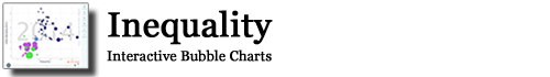
The following Gapminder-style feature shows a comparison of inequality and a range of indicators in all US states as well as 14 of the wealthiest countries in the world. Click the following image to access the interactive bubble charts:
In addition to the feature above, the following charts are interactive data visualisations from figures included in the book. These charts allow you to explore the underlying data or share them in social media:
- Figure 1.1: Household income inequality
- Figure 1.2: Worldwide distribution of income
- Figure 1.3: Income inequality in OECD countries
- Figure 1.4: Being better off than your parents in the USA
- Figure 1.5: Distribution of household income in two London boroughs
- Figure 2.2: GDP per capita by Worldmapper world region, 1820-2010
- Figure 2.3: GDP per capita, comparison, Nigeria and the UK, 1950-2010
- Figure 3.1: Take of the 1% in five affluent nations, 1900 to 2010
- Figure 5.1: Inequality and infant mortality
- Figure 5.2: Inequality and life expectancy
- Figure 5.3: Inequality and ecological/carbon footprint
- Figure 6.1: Age range of compulsorily detained patients
- Figure 6.2: Inequality and voting far-right
- Figure 6.3: Inequality and electoral turnout
- Figure 7.1: Change in global Swiss watch exports
- Figure 7.2: Relative poverty rates by household type, UK, 1997-2021
- Figure 8.1: Inequality and Intellectual Property Patents
- Figure 8.2: The Importance of Poverty and Inequality in the UK
An overview of all material from the book can be found in the material section and you can find the original figures included in the book as well as the original Excel data in the figures section.