Public spending in the UK, and elsewhere in Europe, 1980-2026
For many years the UK, and almost all other states in the world, have been reporting both the amount they spend on public services, and what they expect to spend in future, to the International Monetary Fund (IMF). The three graphs in this article report those figures, first for the UK alone, then for the UK and the four other most populous European countries, and finally for another ten affluent Western European countries. This is to provide a much wider comparison. But first consider the UK alone:
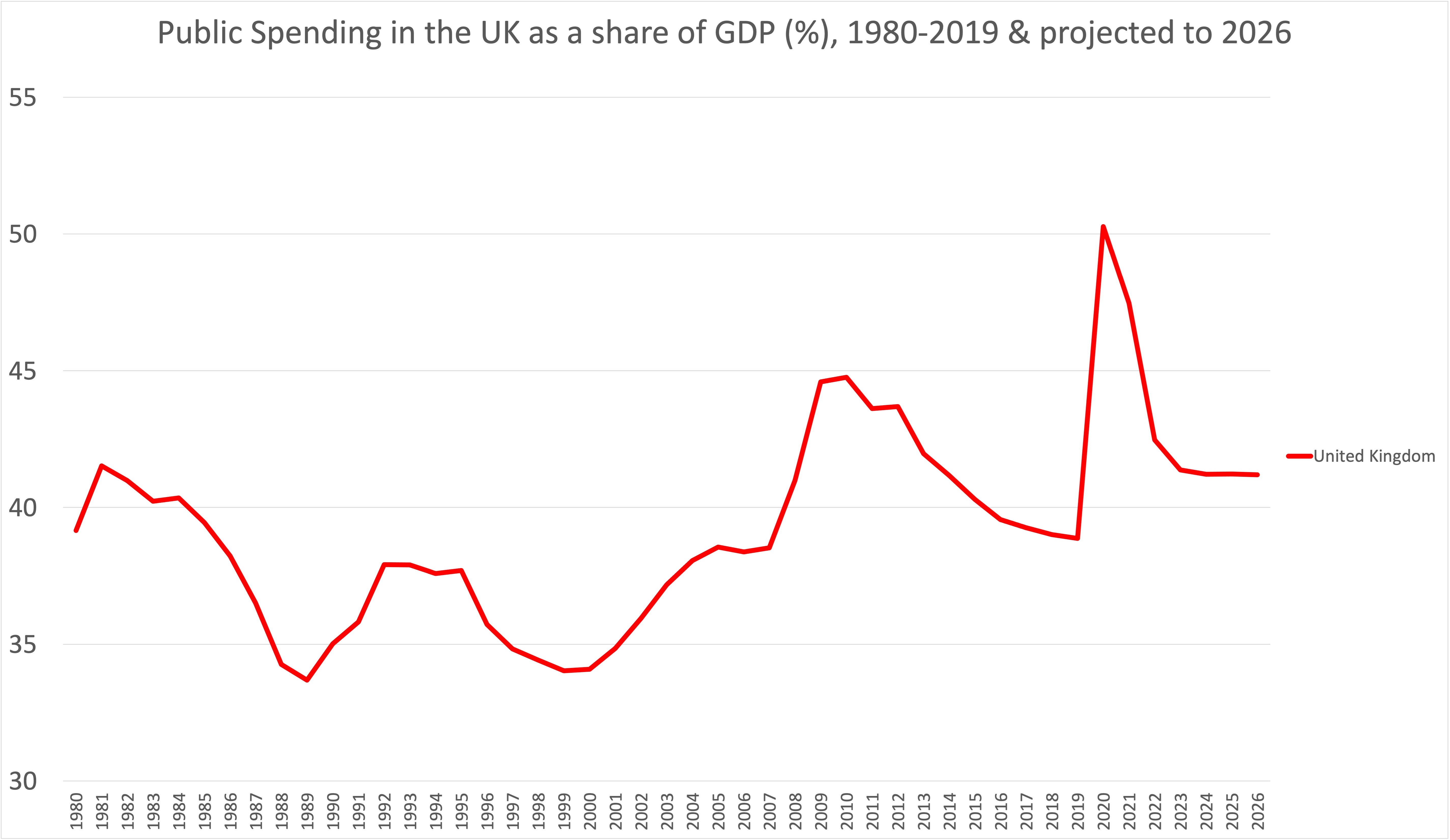
Data Source: International Monetary Fund, World Economic Outlook Database, April 2021, variable GGX_NGDP: General government total expenditure as a proportion of GDP.
Over time public spending in the UK appears to have been rising, and this is true; but it is only true more recently because of two great economic shocks: the banking crisis of 2008 and the pandemic of 2020. Bailing out the banks, increasing and servicing public borrowing, and paying for a huge “moon-shot” track-and-trace system all count as public spending, as well as furlough payments and so much more. Public spending includes the NHS, state education, state pensions, and local government, but also the armed forces and many other outgoings often not thought of as public spending. For example, the rise in the early 2000s in the graph shown here was partly military spending in the UK to pay for the Iraq war.
Public spending in the early 1980s rose as unemployment rose in the great recession of those years when three million people were out of work. Most had to rely almost entirely on state benefits. Spending then fell for the rest of the 1980s as the Conservative government of that decade made cut after cut to health and education spending and tried to privatize as much as it could. Public spending rose in the early 1990s when there was another, smaller, recession, and again a rise in unemployment. It then rose during the “New Labour” years partly as spending on health was improved, but also because of war. However, it was cut extremely deeply after 2010 by a series of Coalition and Conservative governments, who claimed that there was no alternative to deep austerity – until the pandemic hit. Finally, UK public spending is now forecast to be cut at its sharpest level yet in the years to come; and to only remain above 40% by 2026 because of public spending on servicing the increase in public debt. Once that part is taken into account, austerity in the UK is planned to be as great as before the pandemic – according to the figures the government submitted to the IMF – but is now to be enacted in a much shorter time frame: with a cut of more than six percentage points of UK GDP planned for the three years between 2021 and 2024. In contrast, the cut that took place over ten years from 2009 to 2019 was less than six percentage points in total.
What of the rest of Europe? First, consider the other four largest European economies. Apart from when Spain was still emerging from dictatorship and just becoming a democracy, all four have always chosen to spend a higher proportion of their GDP for the public good, on education, housing, health, pensions, welfare and so on (if not quite so much on their militaries). The second graph below shows how the UK’s track record looks in compassion – it is the most miserly and is set to remain so.
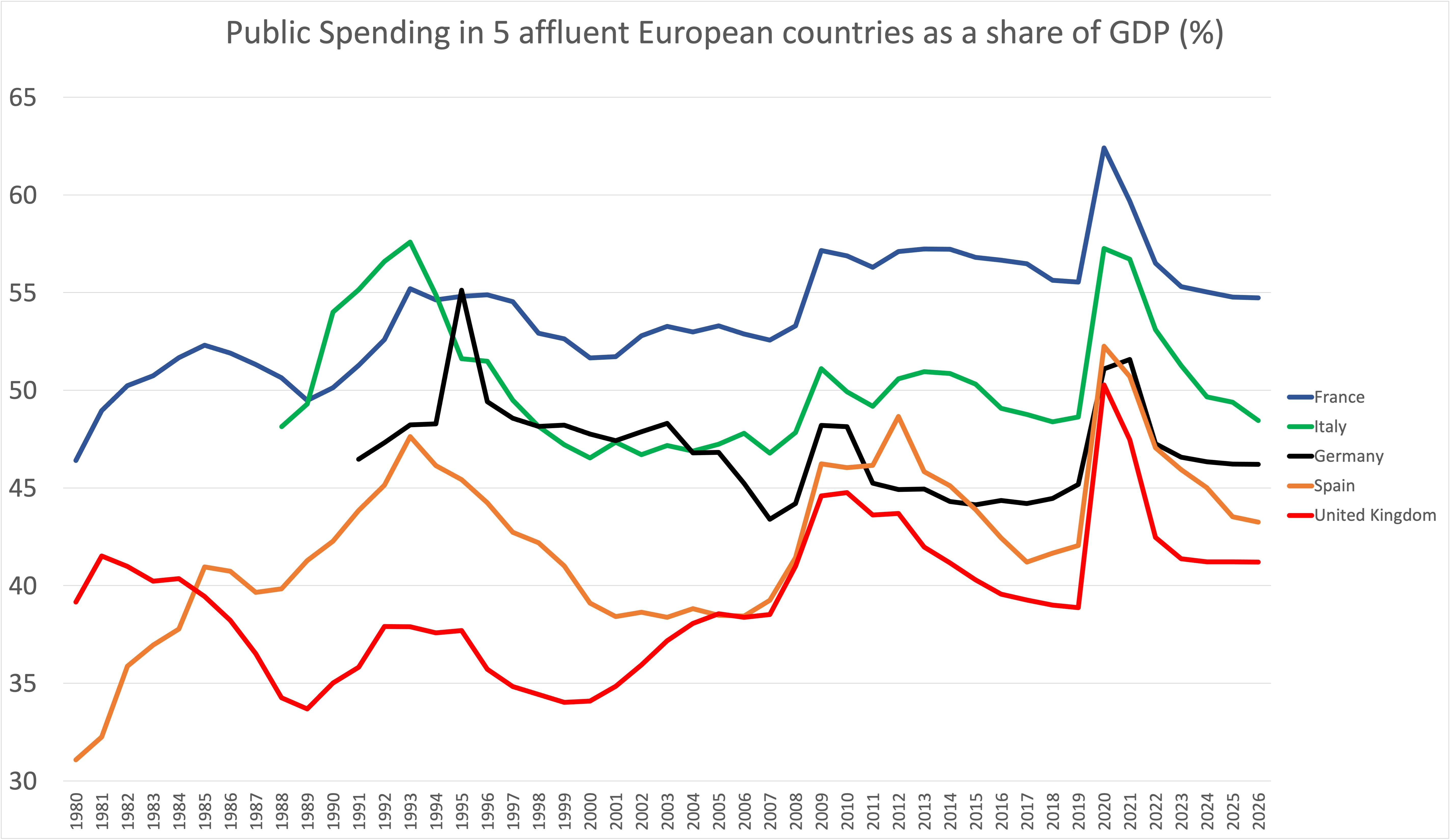
Data Source: International Monetary Fund, World Economic Outlook Database, April 2021, variable GGX_NGDP: General government total expenditure as a proportion of GDP.
There was a period in the mid to late 2000s, and especially when Gordon Brown was Chancellor (and then became Prime Minister) when public spending in the UK was almost as high as Spain’s. In 2019 the Labour Party manifesto made spending promises that would have increased public spending to just below German levels, had all those promises been honoured by the end of five years in government. In the event, the Conservative government elected in 2019 was forced to increase public spending levels in the UK to far above the amount Germany had been spending in 2019; but not on things such as improving funding for British state schools to German state school funding levels, or funding the normal activity of the NHS at the level of German public health spending (which is roughly a billion more euros being spent on health each week). Note how all the large European countries increased their public spending as a share of GDP by a remarkably similar amount in 2020; but how they all project slightly different falling trajectories in the projection up to 2026, with the UK sloping steepest downwards.
Finally, is the UK still an outlier when smaller European countries are also included? The last graph of the three shown here adds another ten European countries, also drawn from more affluent Western Europe but not including some of the smallest countries in this region. It is again clear from this graph that the UK has been an outlier, an exception in Europe for many decades. Public spending in the UK has been so low for so long that it is only comparable to Spain’s when it was emerging from dictatorship and just becoming democratic; and to public spending in Greece, but again only as it was becoming a democratic country following the military dictatorship there of 1967-1974. In some of its features the UK has behaved economically like a state that has been largely ruled for the past fifty years by a kind of non-democratic junta that sees public spending on services as something to be suppressed.
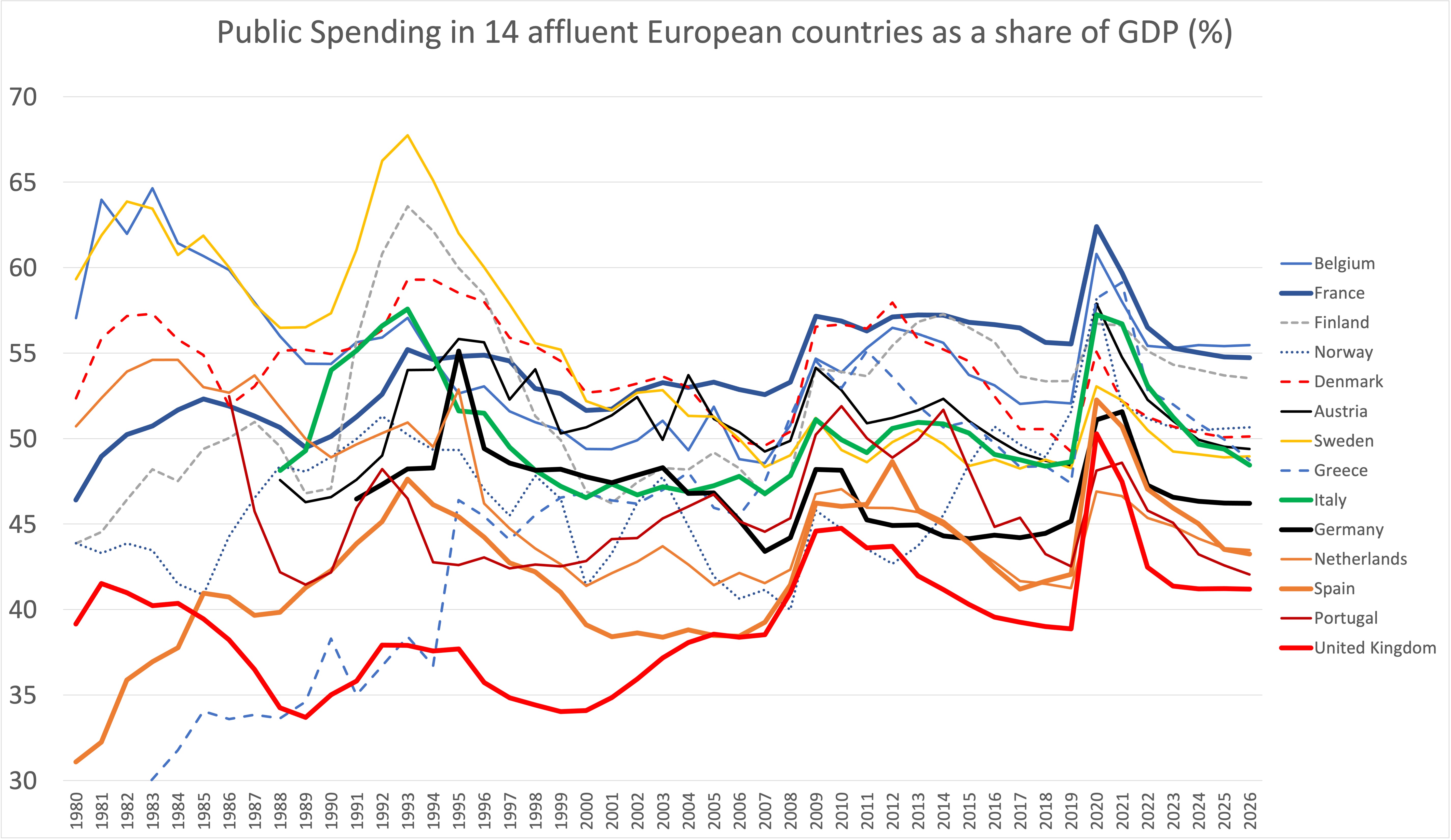
Data Source: International Monetary Fund, World Economic Outlook Database, April 2021, variable GGX_NGDP: General government total expenditure as a proportion of GDP.
The final graph above shows that France is not an outlier: Belgium and Finland spend just as much. Similarly Italy is not profligate – it now spends in the same ball-park as Norway, Denmark, Austria, Sweden and Greece. What the graph above also shows is that Germany is, nowadays, a little miserly. However, it is similar to the Netherlands. And Spain, which in most years spends a little less on its public services than Germany, is not dissimilar to its neighbour Portugal. All larger affluent countries in Western Europe have been, and will be spending relatively more on the common good than the United Kingdom.
Public spending levels tend to track taxation. Internationally, those states that tax less, spend less. The majority of the population have poorer quality healthcare, schools and housing. Their universities, railways and water supplies are more often privatized. And their citizens suffer by being less well educated, living with poorer health, and being more often looked down on by those in control. Until the UK is a more democratic state with, for instance, a voting system with proportional representation that truly reflects the will of the people, it is likely that it will remain at the foot of these graphs. However, as that transition to a fuller and more just democracy has eventually happened for every other state shown in the final graph above; it might well be too pessimistic to think that it will never happen in the UK, and in all its regions.
Data Source: International Monetary Fund, World Economic Outlook Database, April 2021, variable GGX_NGDP: General government total expenditure as a proportion of GDP. Note that Switzerland was not included in the comparison because it has an unusually high GDP to public spending ratio due to some global companies being nominally based there / profit repatriated there. It’s public spending on health is amongst the very highest in Europe and yet its overall public spending as a proportion of GDP looks low. There are similar issues in the case sin Ireland, Luxembourg and San Marino.
For a PDF of this article and its original publication on-line click here.