The 2017 UK General Election Result in Three Graphs
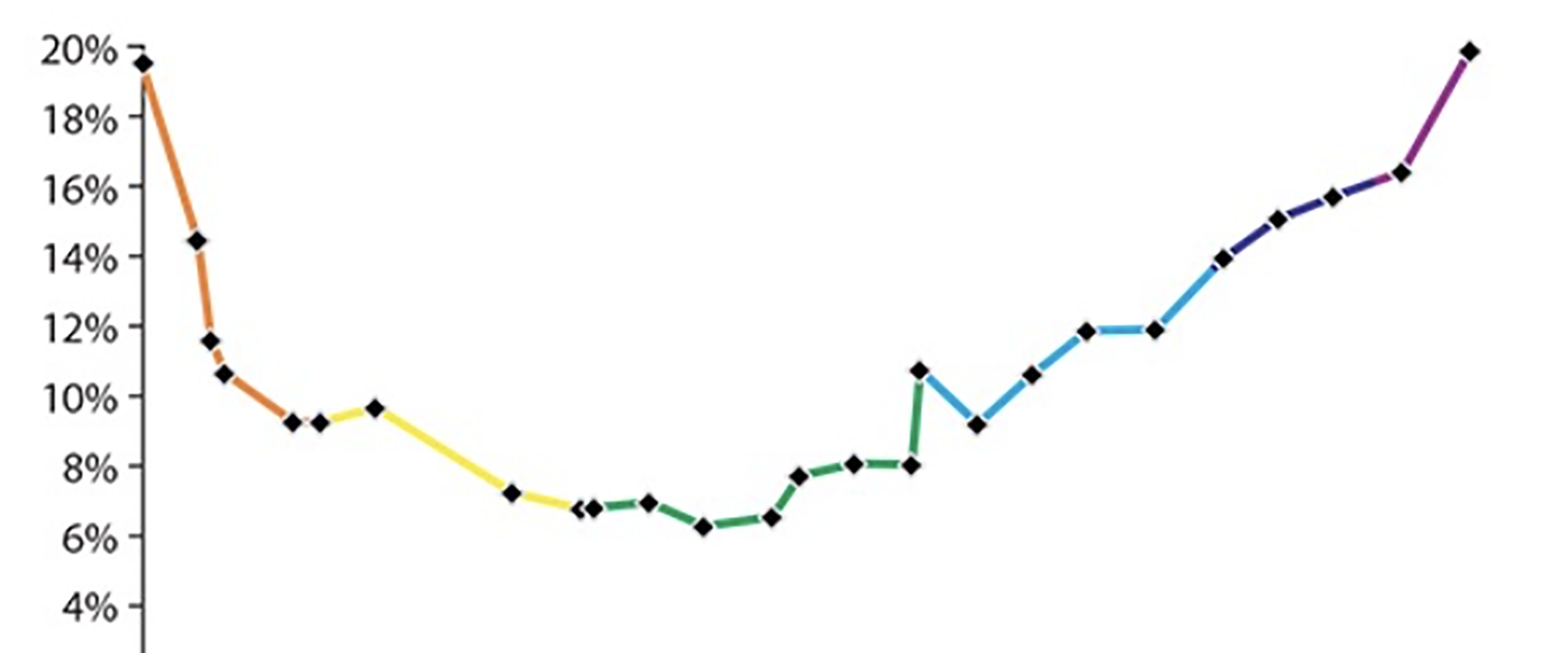
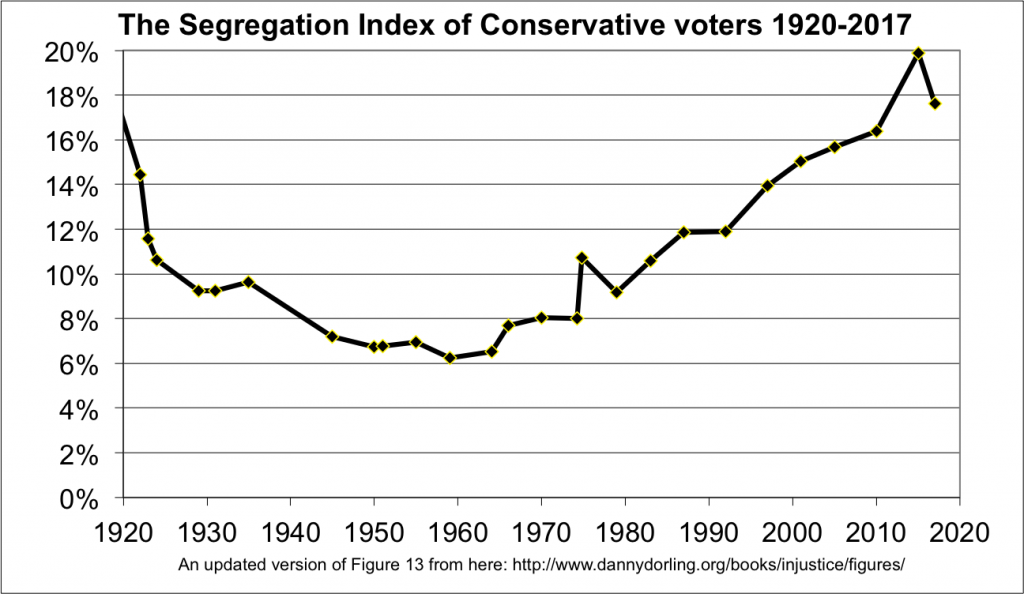
There was one noteworthy feature of the 2017 General Election that has not been commented on at all. For the first time since 1979 the segregation index of British Conservative voters fell.
Extract from article published in Public Sector Focus
For the first time since 1979 the segregation index of British Conservative voters fell. The segregation index is the minimum proportion of Conservatives voters who would have to be moved between constituencies if there was to ever be an absolutely uniform distribution of support for that party. That index had reached a historic peak in 2015, beating its last ever-highest record that was held in 1918. At every General Election from 1979 to 2015 support for the Conservative party rose the most in the areas it had already done best in. That almost forty-year trend ended in June 2017. It is not impossible that the 2017 fall in Tory voter segregation is the beginning of a long fall, such as that which occurred from 1918 right through to the 1960s. Or it could just be a blip as occurred after the October 1974 General Election. It is too early to tell, but it is nevertheless remarkable.
There was so much more to see in the June 2017 UK General Election than has yet been described. It is partly because the result itself was so unexpected that we have not yet fully asked what it might mean and what it highlights. One graph that was widely shared around the Internet shortly after the General Election. It showed that under Jeremy Corbyn’s leadership Labour achieved its largest swing as conventionally measured since that of 1945. Arguably the swing was even greater than that of 1945, which occurred over a ten-year period (the previous general election having been held in 1935). This latest swing occurred in just two years.
What happened in 2017 was not really a swing. The Conservative vote did not fall, in fact it rose by 5% to 42% of all those who voted. But the Labour vote rose by almost twice as much, by roughly 10%, to reach 40% of all who voted. Some voters will have swung from Tory to Labour (and a tiny number in the opposite direction), but most of the new Labour votes will have come from people who had voted for other parties in the past or who had not voted, especially from younger voters including those who had never been allowed to vote before because they were too young. The other reason Corbyn did so well is because Blair (in comparison to 1997) had done so badly in 2001 and 2005, Brown did even worse in 2010 and Miliband achieved only a risible positive swing in 2015.