Life in Britain
Using millenial Census data to understand poverty, inequality and place
Back to main page of the report
Some key findings
The 2001 Census tells us that:
- areas with the greatest needs for health services tend to have the lowest numbers of doctors and other health professionals
- but these areas also have the highest numbers of people providing unpaid, informal care to friends, family and neighbours
- in most of the UK, young people are most likely to gain good qualifications if they live in an area with lots of well-qualified older people
- and the areas with the highest numbers of young people leaving school with no qualifications tend to have the lowest numbers of teachers
- substantial numbers of second residences and holiday homes are found in rural areas of the UK
- and these areas also contain the highest proportions of households that might be having difficulty getting on to the property ladder
- most high-status, well-rewarded jobs are found in London and the South East of England
- and the place in which someone lives can sometimes be a more important influence on their prospects of a well-rewarded job than their qualifications
- a large number of young people provide care on an informal basis for their family and friends
- and in areas where many young people are carers, many young people also live in families with no adults in paid employment.
Example of results
Provision of Health Care
Analyses divide the country into unitary authorities, counties and former metropolitan authorities. The first graph here shows the relationship between the proportion of each area’s population with limiting long-term illness and poor health, and the number of qualified, practising medical doctors per head of population. It is apparent that the populations with the greatest need for health services have the lowest concentrations of qualified, working medical practitioners. This demonstrates the continued presence of an ‘Inverse Care Law’ (see J. Tudor-Hart (1971) The inverse care law, Lancet, 1, 406-412.).
Graph 1: The inverse care law: areas with the highest levels of poor health tend to have the lowest numbers of medical practitioners.
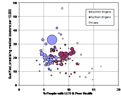
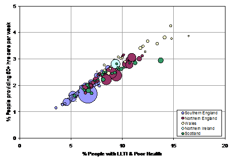
Note: In these graphs, each circle represents a county, unitary authoirity or former metropolitan county. The area of the circle is proportional to the population.
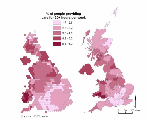
However, the second graph shows that informal care (that provided by friends, relatives and neighbours) tends to be provided in almost direct proportion to need for that care. The map below illustrates the proportion of the population providing care across the UK.
The graphs and map are taken from the reports ‘Doctors and Nurses’ and ‘In sickness and in health’, where these relationships are further described and analysed.
Graph 2: The ‘positive care law’: areas with the highest levels of poor health tend to have the highest number of people providing care on an informal basis.
Map: The distribution of people providing informal care for 20+ hours per week across the UK. Both maps use the same shading scheme. However, the map on the left is a cartogram, which makes each area proportional to its 2001 population.